BrightWaste Sustainable Web App
🥳 Courier Hacks Winner 🥳
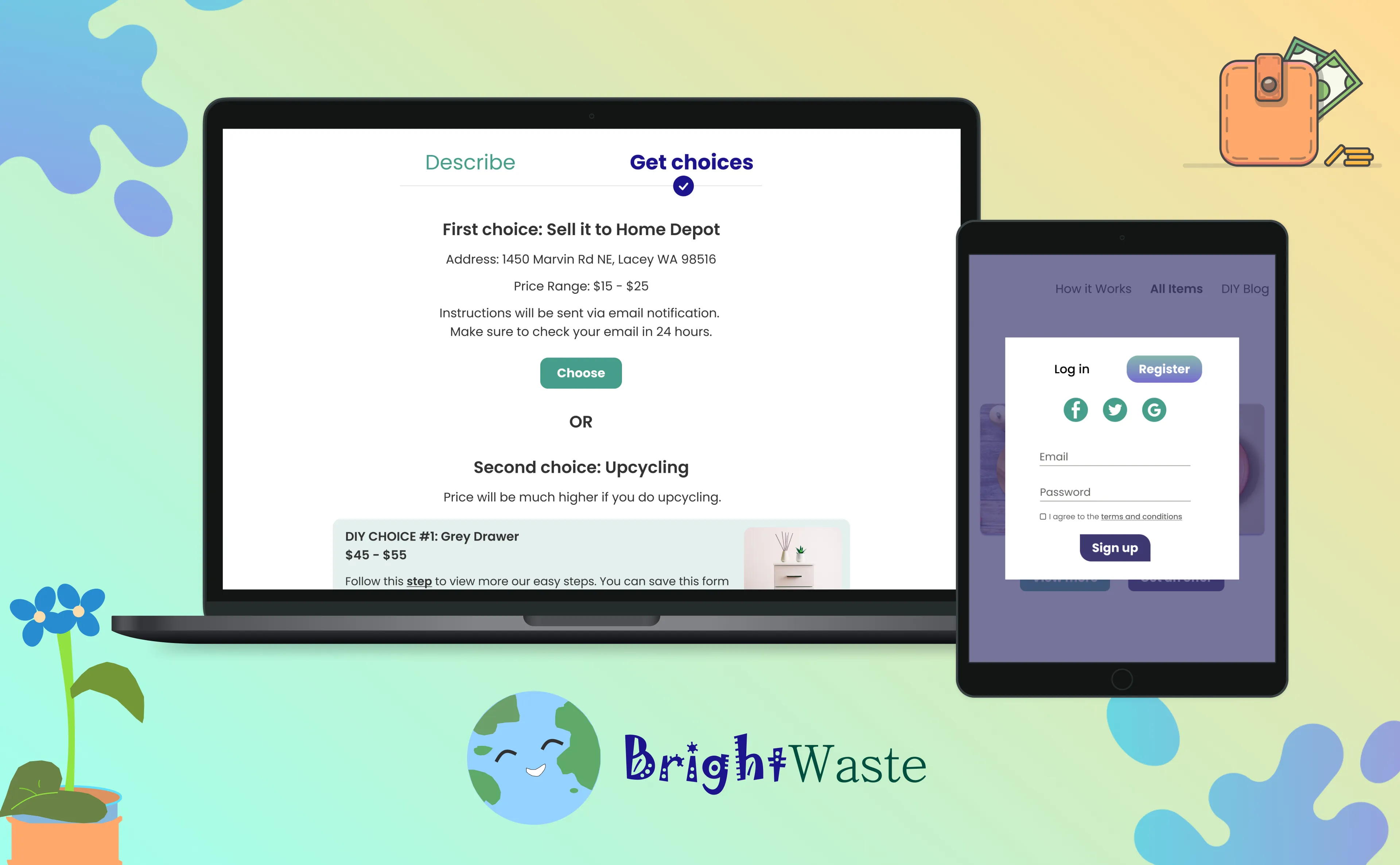
A Sustainable Marketplace Website that can give people options either to sell the used items directly to the shop or upcycle and sell it for a better price.

TEAM
2 developers, and myself as a UX Designer and UX Writer

DURATION
Oct 2022 - Mar 2023

TOOLS
Figma, Github, Visual Studio Code
OVERVIEW
Analyze the goal of BrightWaste
Our main goal was to encourage people to live sustainably and earn
more money at the same time. The idea of recycling has been a trend
since years ago. The question is, does it work?
Based on the research,
About 110 million glass bottles are thrown away and only one-third get recycled. -- weforum.org
It could be easier to sell the used item for a lower price, but instead of doing so,
get our creativity going and turn it into something more meaningful and
can have more value to it?
It doesn't only impact the earth; also, we can contribute to the economy
cycle.
...which helps people to get plenty of ideas on how to recycle their stuff and lets the potential seller get notified when they can sell the products for a better price .
IDEA VS. USER PERSPECTIVE
Inspiration behind the project
I love to do DIY in my free time. So, I went to a materials store close to my area, Lacey, WA, US, to buy wood to build my new shelf.
I was disappointed with the furniture waste left in the store. At that time, I got a chance to interview two people that were shoppers.
Question: Tell me how you reuse the materials (furniture, glass bottle) at home.
And it was shocking to listen to their answers:
I didn’t do...
anything to it. I just place in the closet or storage and threw it after few
years.
-- Jason, 20, student
I sold it...
in OfferUp for cheaper price or tossed it in the waste dump.”
-- Sarah, 52, housewife
At shop, we usually..
sell it for cheaper price. However, we wish we could have a workshop or place where we
can collect these woods and repurpose them.
-- Worker at Home Depot, 35
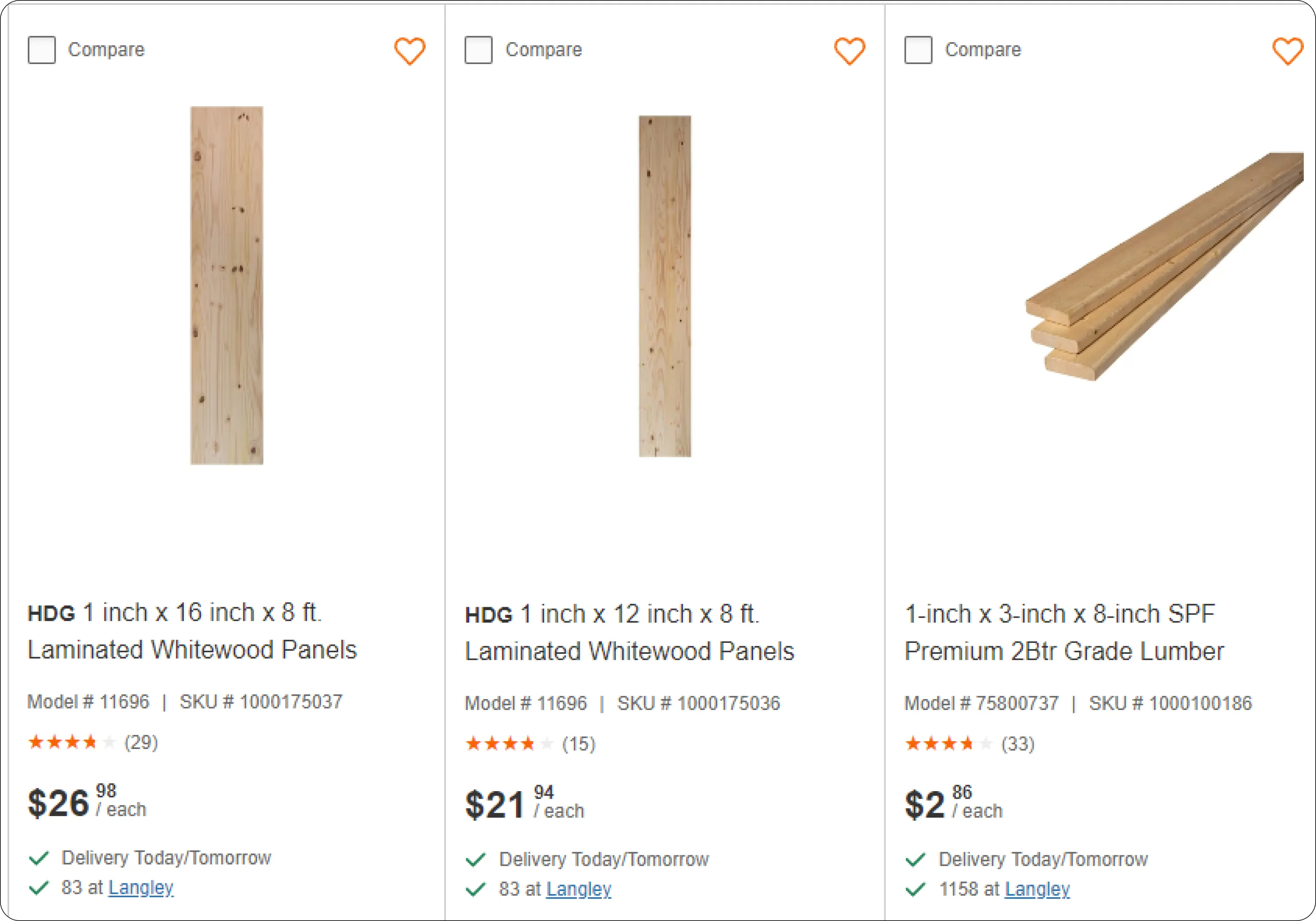
The illustration above shows new wood that is sold in store.
MORE RESEARCH
Were there any competitive analysis we should worry about?
➡️ OfferUp and Facebook Marketplace
Pros:
Cheaper price.
Browse items in just a few minutes from your phone.
Cons:
Meeting in a public location can have safety issues due to the risk of meeting strangers. You might also encounter unreliable buyers or sellers.
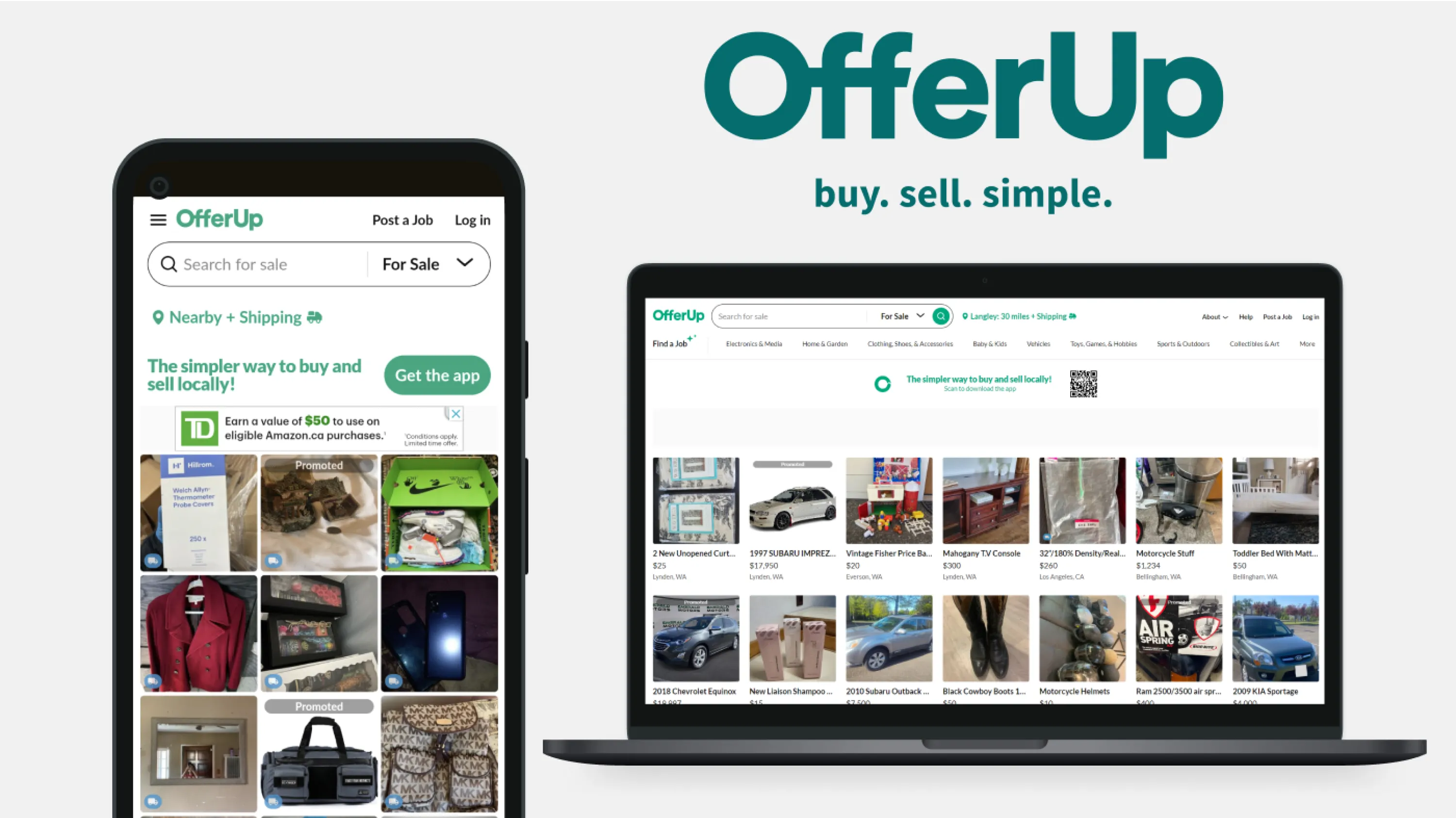
In our search for the best upcycling apps, we explored some alternatives like Depop and Refinery. Here's what we discovered:
➡️ Depop and Refinery
Pros:
The website is straightforward.
Can negotiate the price.
Cons:
Shipping cost issue.
Due to the limited amount of time, we didn’t develop app-based platform. Instead, we focused on creating a desktop view, as it simplifies the listing process.
Regarding the item condition issue, we wanted the shop to provide an estimated fair price. However, the final price may be subject to change upon inspection of the item at the shop.
Second interview sparked more ideas
We ended up interviewing two people from the last interview in the material store, despite time constraints.
These were the follow-up questions we asked them:
How is/was your experience getting rid of the unwanted items?
Answers can vary from selling the item, giving it away for free, or holding a garage sale.
Are you planning to move anytime soon?
Luckily, we found the perfect users who were planning to move out soon and wanted to get rid of their unwanted items.
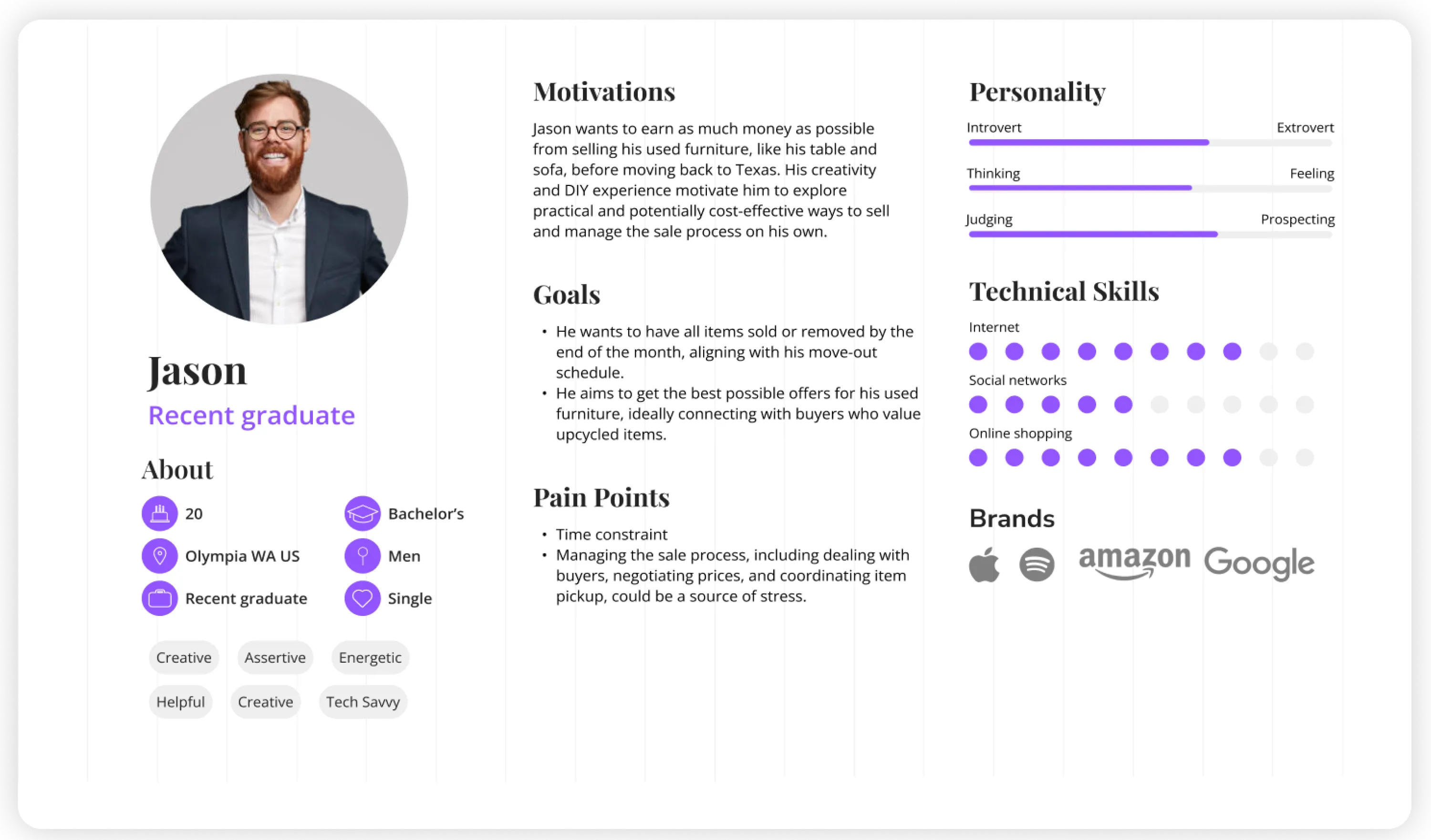
➡️ First user: Jason, 20, student
Jason planned to move back to his hometown of Texas after attending college at the University of Washington Tacoma. He was creative and had experience with DIY projects, often refurbishing used products for his personal use. His expectations were:
To earn more money from selling his used table and sofa.
To clear out the items he wouldn’t be taking with him, as he had up to a month to move
out.
➡️ Second user: Sasha, 52, housewife
She wasn’t as creative as Jason, but her son was. She mentioned that she was moving to a new apartment in another state and needed to get rid of a lot of furniture and kitchen appliances. She always had trouble disposing of unwanted items, especially broken or used ones. Her expectations were:
Easily dispose of unwanted items using our website.
Connect with buyers (preferably in nearby stores) and receive good offers for used or
upcycled items.
Simplify and secure the transaction process.
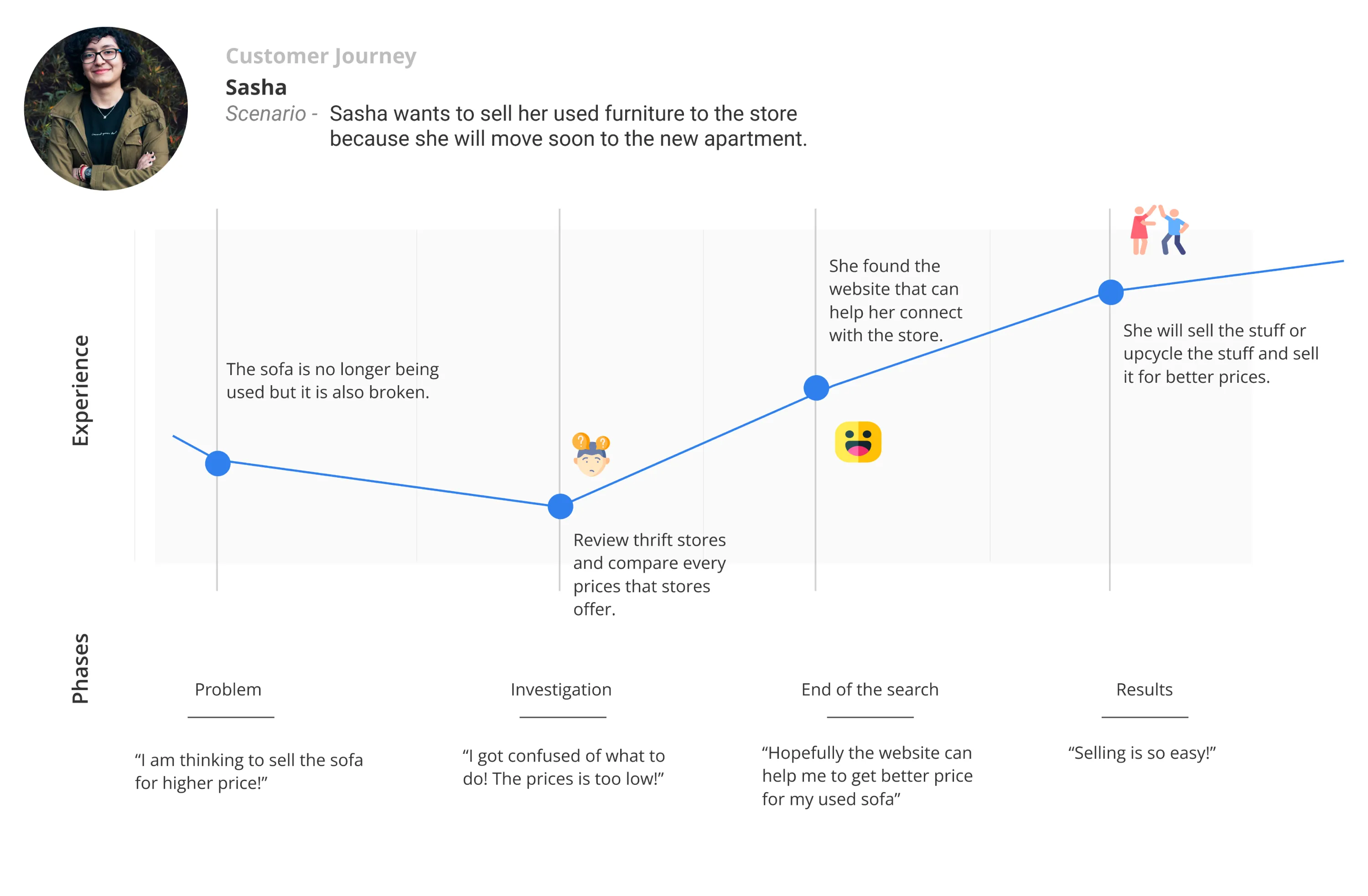
Customer journey
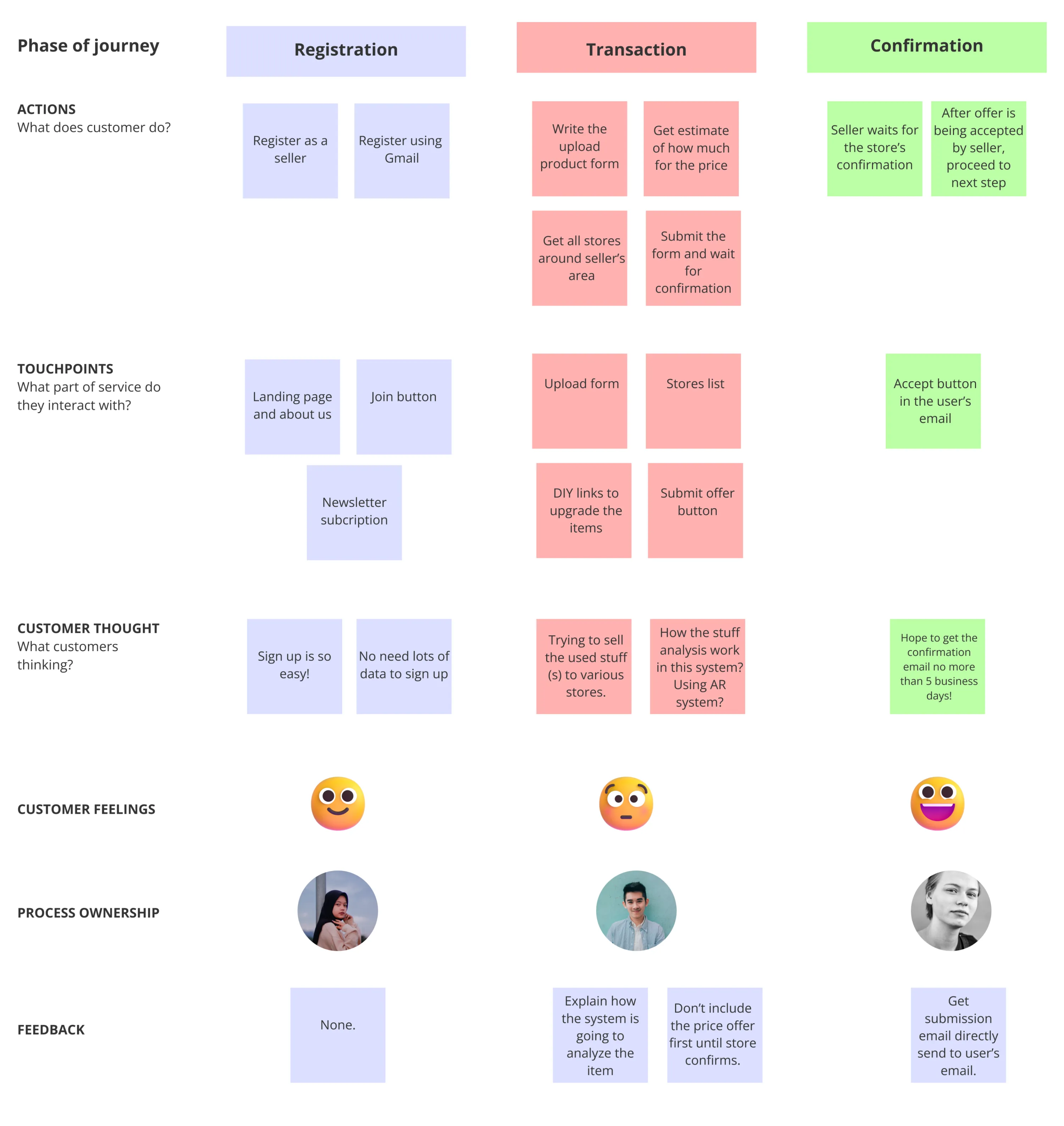
Based on the research, I have curated the results into two types of customer journeys: specific and general.
This allows us to understand what to expect for the features to be developed from both a broad and targeted perspective.
BRAINSTORMING
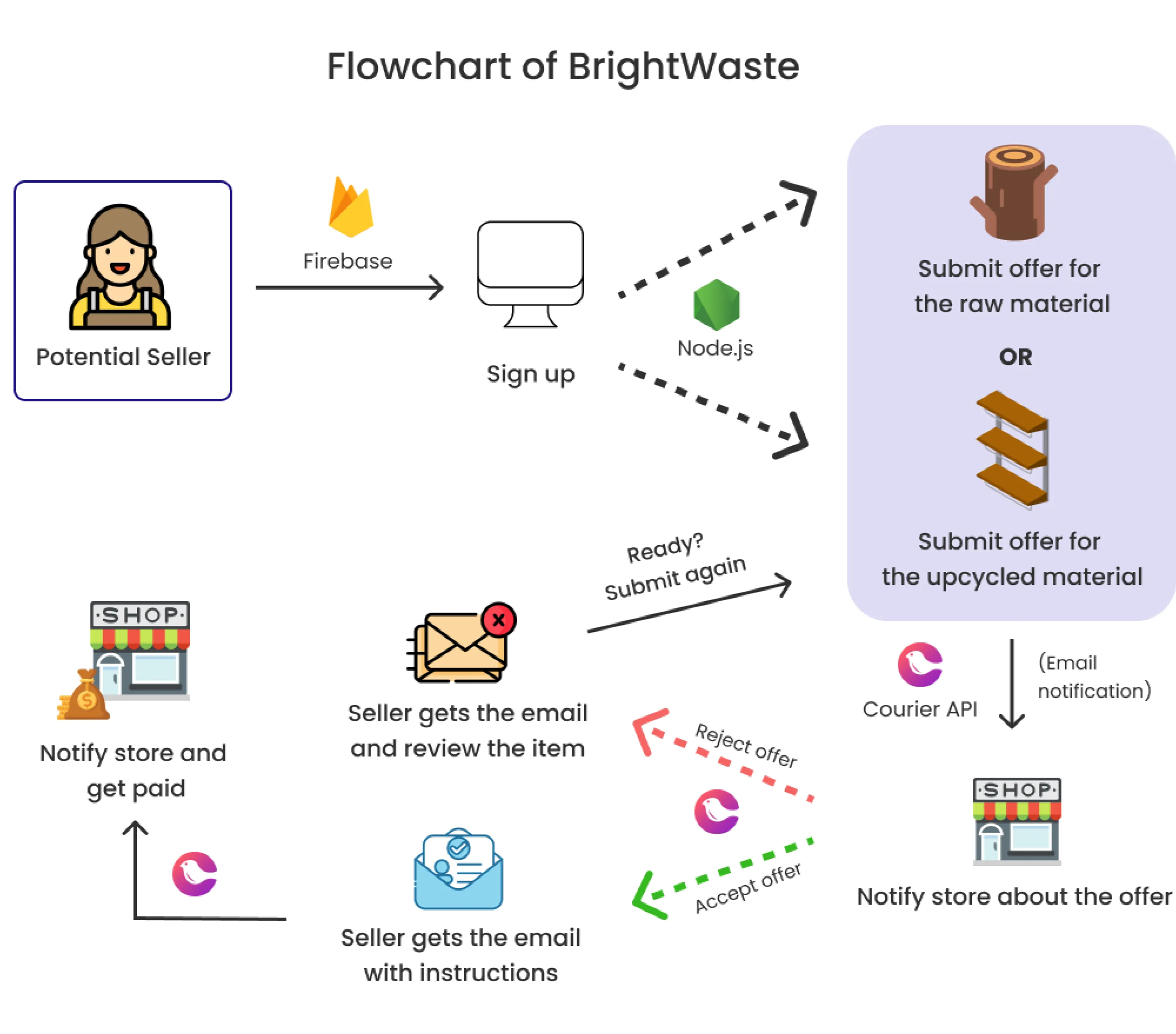
Flowchart of BrightWaste
I created a flowchart to help all the team members clearly communicate, understood our goal and how we achieved it.
We used Firebase to connect to the database when a user signs up. We used Courier API to notify users through email.
Register an account
Users can register their accounts as usual, but due to time constraints and for easier development, we initially focused on building the Gmail sign-up version.
Landing page
After registration, users will be directed to the landing page, where they can learn about what BrightWaste offers.
Deal starts
Users can initiate a deal or start a transaction by completing the upload form.
Few options to start an offer
The user has a few options: they can either sell the item directly, wait to upcycle it into a better product, or save the offer for later if they choose.
Two cases here
If the user chooses to upcycle, they can retrieve the saved offer, resubmit it, and the system will notify the store about the offer.
Alternatively, the user can sell it directly without needing to upcycle, and the store will contact them within a few days to proceed with the transaction process.
Store decides
The store can then decide whether to accept the offer or not.
Resubmit or done?
If the store doesn't accept the offer, the user can resubmit it to another store. If the store accepts, they can proceed to the next transaction. We haven't finalized the shipping fee yet, as it depends on how the store wants to handle it. For now, it's just a concept.
***
After the transaction, the confirmation waiting time varies depending on the store,
typically taking around 3 days.
In the future, our system will be able to notify the store if they respond too slowly or fail to respond within the 3-day period. We should also account for public holidays when the store may be closed.
IDEATION
The features
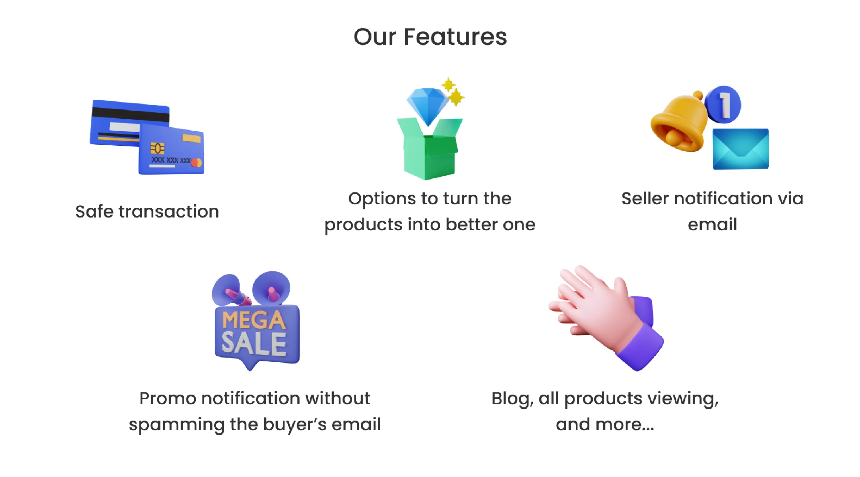
Our features included:
➡️ Safe transaction
Transactions will no longer be allowed outside the store or in hidden areas to prevent scams and ensure safety.
➡️ Sharpen your creativity plus earn $$!
Improving a product can be a great way to earn money and learn new skills. If you can enhance its value, you can often sell it for a higher price.
➡️ And more... check below
UI FOCUS
The design system
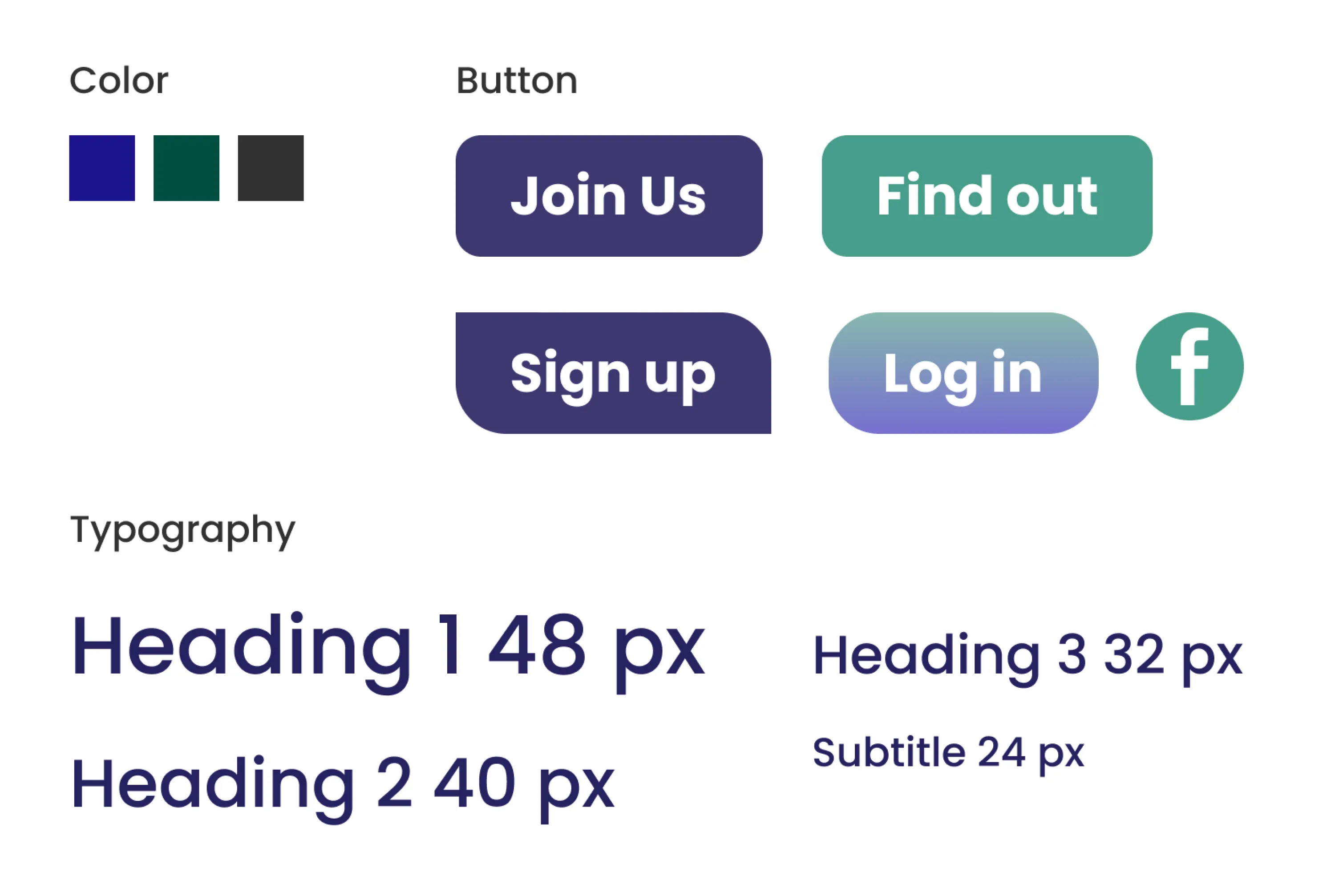
Color choices:
Blue and green:
These colors reflect our logo and represent earth in general.
Black (#323232):
This is used exclusively for text elements, ensuring optimal readability.
The button comes in different variations to make it easier to distinguish between different functionalities.
Regular Shape
(Join Us, Find Out): This is the primary button style, used for navigation bars and
landing pages. It serves as a clear Call to Action (CTA).
Curved Shape
(Sign Up): Used exclusively for the signup experience, prioritizing aesthetics.
Gradient Button:
This button offers a choice between logging in or registering.
UI AND CONTENT FOCUS
Focusing to add value to landing page is a key
The landing page should serve as a way to engage the audience with BrightWaste's mission. I wanted the design to be fresh, and on the first page, users should have the option to view available products in their area.
Rough draft (2 options):
Get higher value for your used materials and help earth to reduce the waste and
people to contribute to economy grow.
Get higher value for your used materials and help earth to reduce the waste and
help society to contribute to economy grow.
Final draft for home page text:
Get higher value...
for your used materials and help earth to reduce the waste and lead society to a brighter future.
The navbar explanations:
How It Works:
This section explains the process step-by-step.
All Items (upcoming feature):
Discover a curated selection of popular items available in various locations. Enable
your location to view items near you.
DIY Blog:
Join our community and explore sustainable articles and stories.
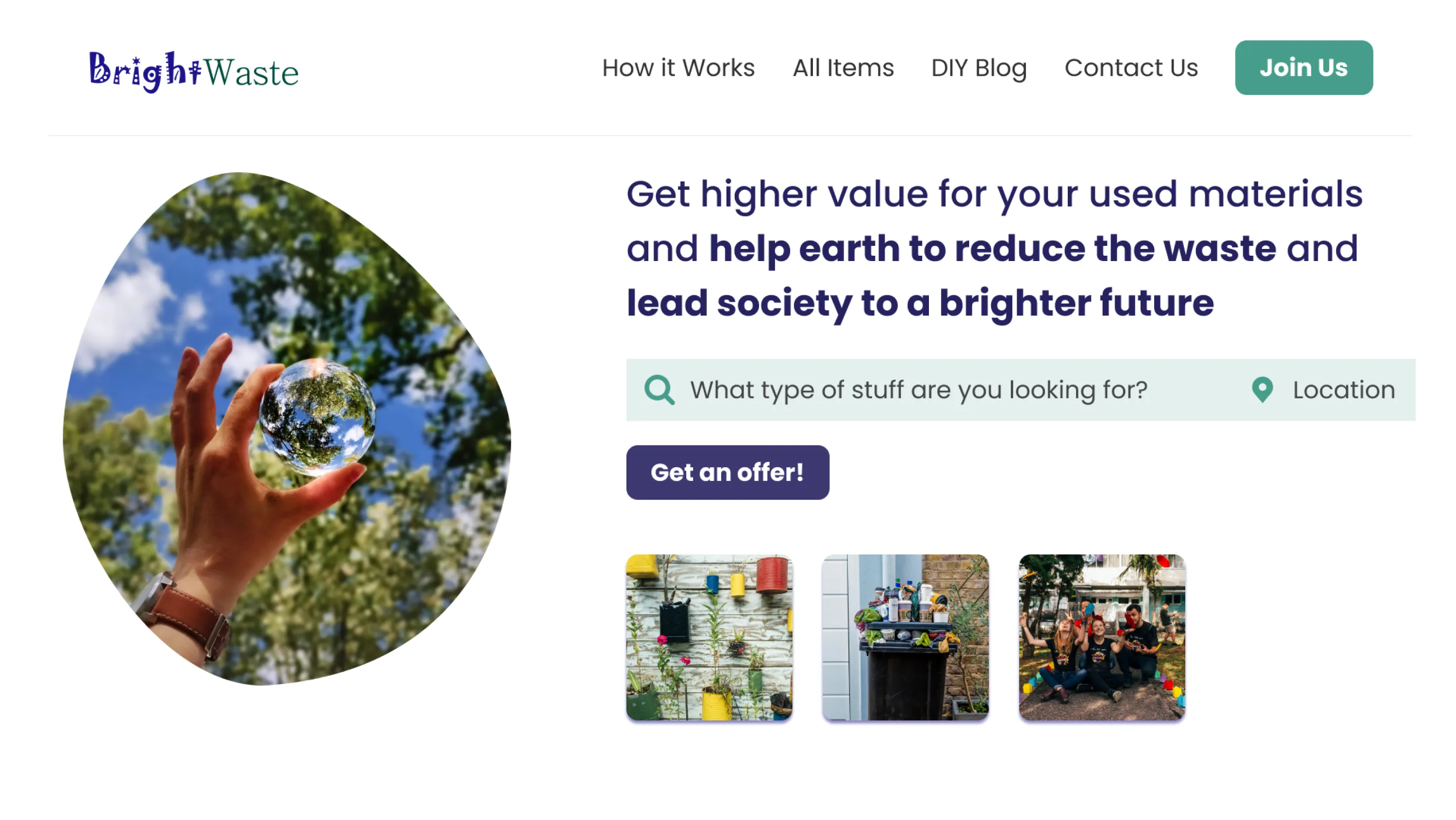
Explain the steps
We want the users to know how to utilize our website to earn income and, at the same time, contribute to earth.
I want to create a flow that looks like a marketplace so users or audiences can easily pick up the idea or how the sales work. The additional icons represent the step they need to take to get started on BrightWaste.
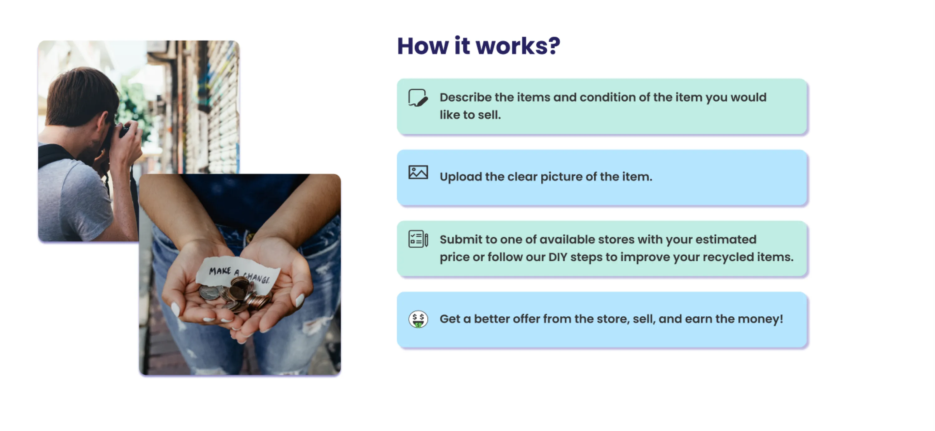
Quick video of the landing page
Due to time constraints, I designed the product in a simplified manner. However, I ensured that it includes all the essential features users would expect in the initial version.
Make offer in few steps...
For the video prototype, we utilized Google accounts (connected to Firebase) to create offers. In the future, we plan to expand our capabilities to include other social media platforms, such as Facebook.
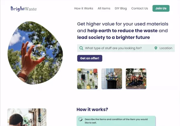
E-commerce style in our website
Iteration 1
For users who wish to upload their products, I positioned the categories on the left side.
Users can directly complete the product upload form. When a user hovers over a product type, they will see the corresponding category name.
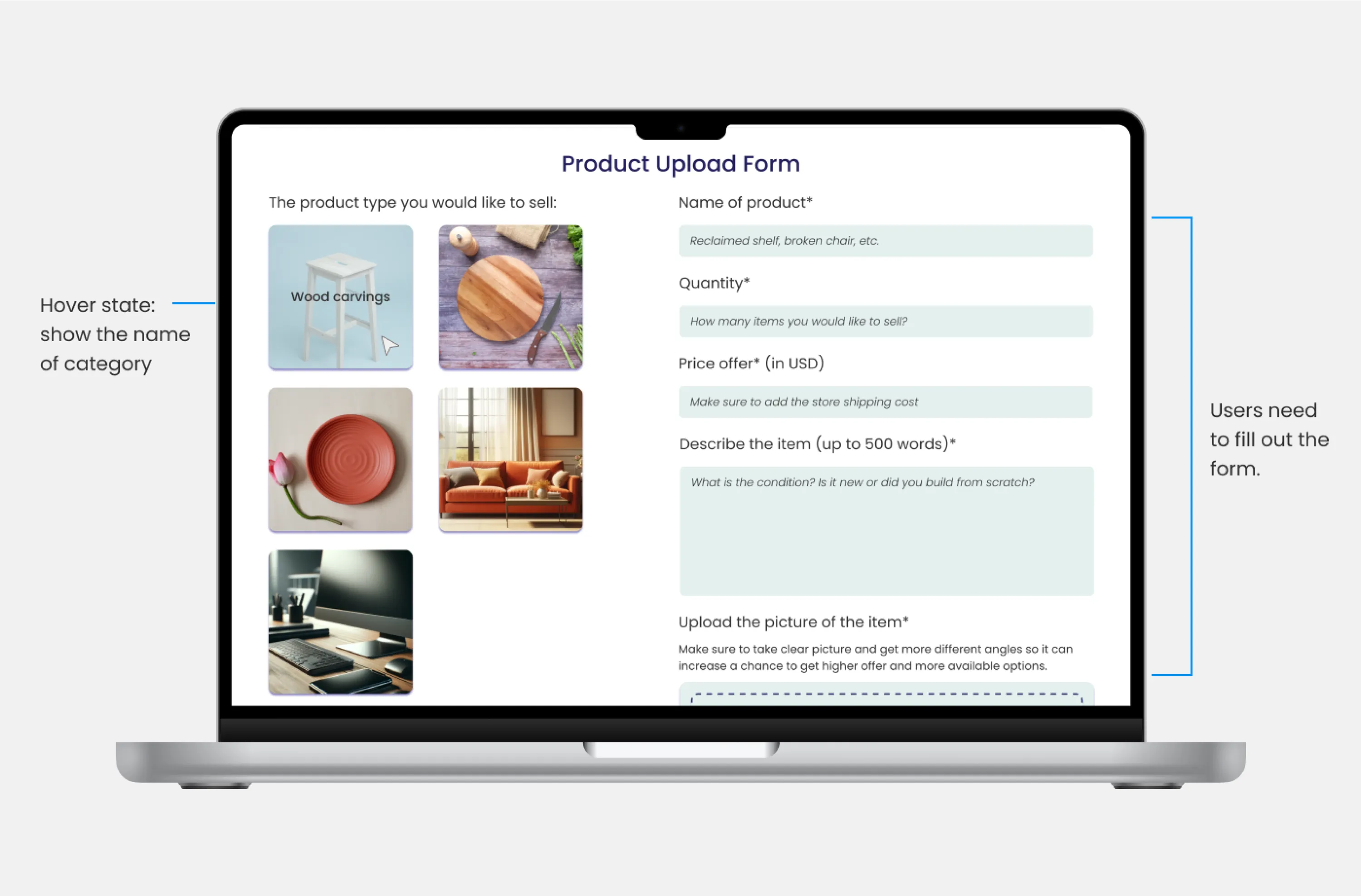
However, concern happened...
Iteration 2
After consulting with our developers, they indicated that it would not be feasible to develop the first iteration within the current timeframe due to skill limitations.
I also had the opportunity to discuss the first iteration with three users. However, they expressed confusion regarding the placement. As a result, I decided to revise the concept.
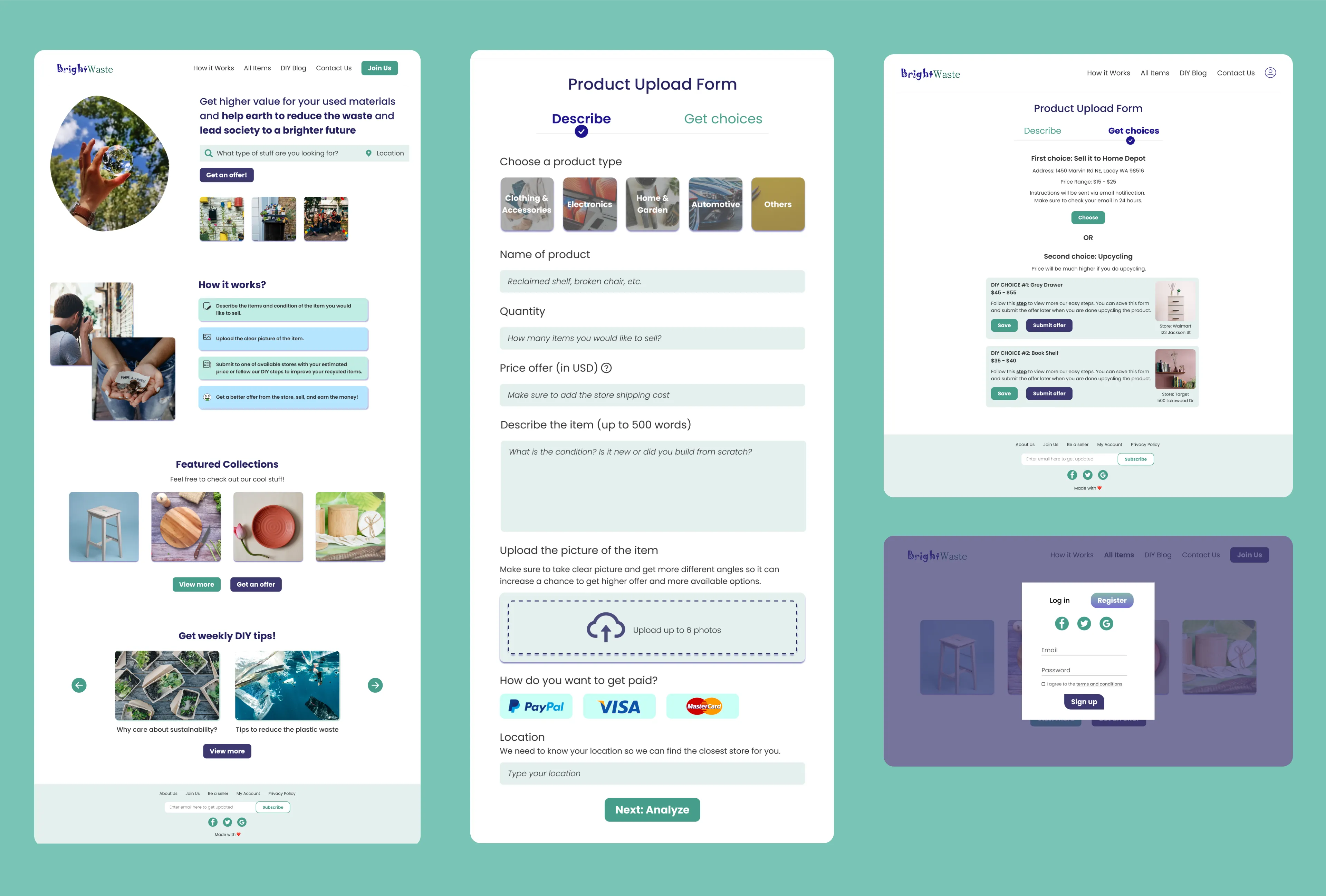
➡️ I implemented a tracker button to monitor user page activity.
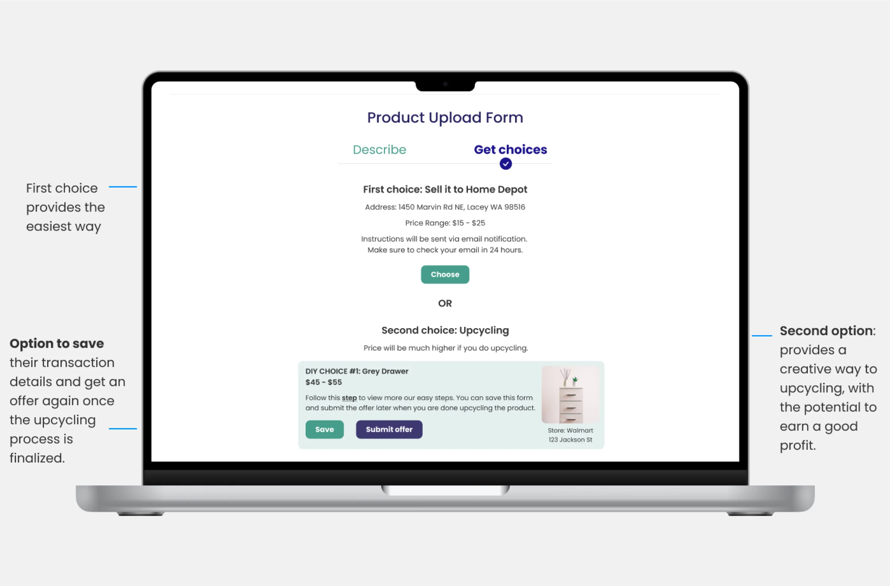
The trackers offer two options: 'Describe,' a general upload form for item descriptions, and 'Get Choices,' which provides options for selling directly to the store or upcycling and selling later.
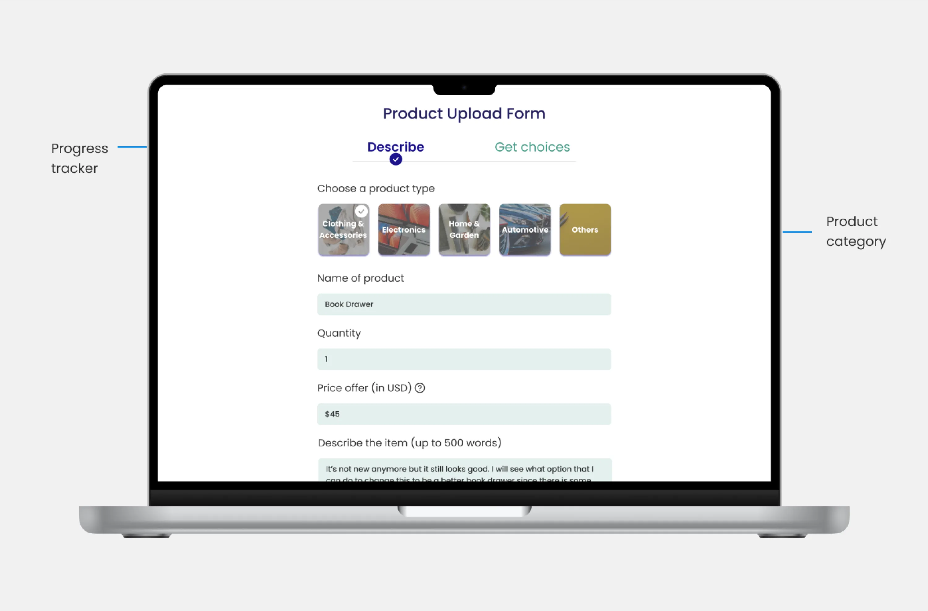
➡️ Next: Select your preferred stores.
Once users complete the form, the system will utilize the Google Maps API to determine the nearest store to their location.
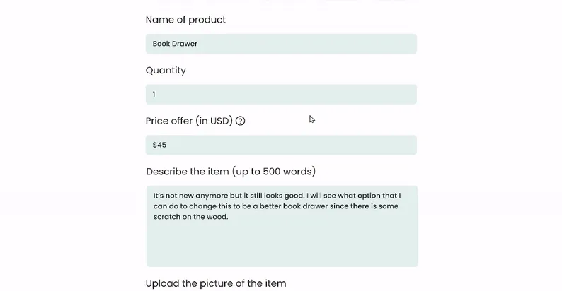
➡️ To conclude...
Users need to follow two pathways to submit an offer to the store.
First option: Describe the item as details as possible
Similar to Amazon or Alibaba, we implemented an e-commerce feature that allows users to describe the items they wish to sell.
Second, get two choices...
First option:
Users can skip the upcycling process by clicking here. However, this will result in a lower offer price.
Second option:
Ready to sell?
Click "Submit Offer" to finalize your offer after upcycling.
Need more time?
Click "Save" to store user’s transaction details. We'll include DIY upcycling steps
and estimated selling prices for user’s reference.
Once user has finished upcycling, user can easily return and submit their offer.
MULTITASKING
Learn as a designer and developer!
Due to time constraints, I took on the role of front-end developer (minor task only). Please feel free to review the prototype and development progress on GitHub.
IMPACT
Reviews about the website (in general) and campaign video
While we were unable to conduct a formal usability test, we gathered feedback from those around us regarding our progress. I also got a chance to create a campaign video that you can check below.
So stunning!
“The website idea with the animation on campaign video make it look stunning! Keep it
up!”
— Sara L., 28
So thorough!
“The writeup is so thorough! I really like the challenges that you mentioned, especially
building a scenario for this project.”
— Shreya, 24, Developer Advocate @Courier
Simple design!
“I appreciate how the design and idea remind me that even the smallest actions can
contribute to caring for the Earth.”
— Sara L., 28
THE END?
We earned best results but...
There’s still a long way to go!
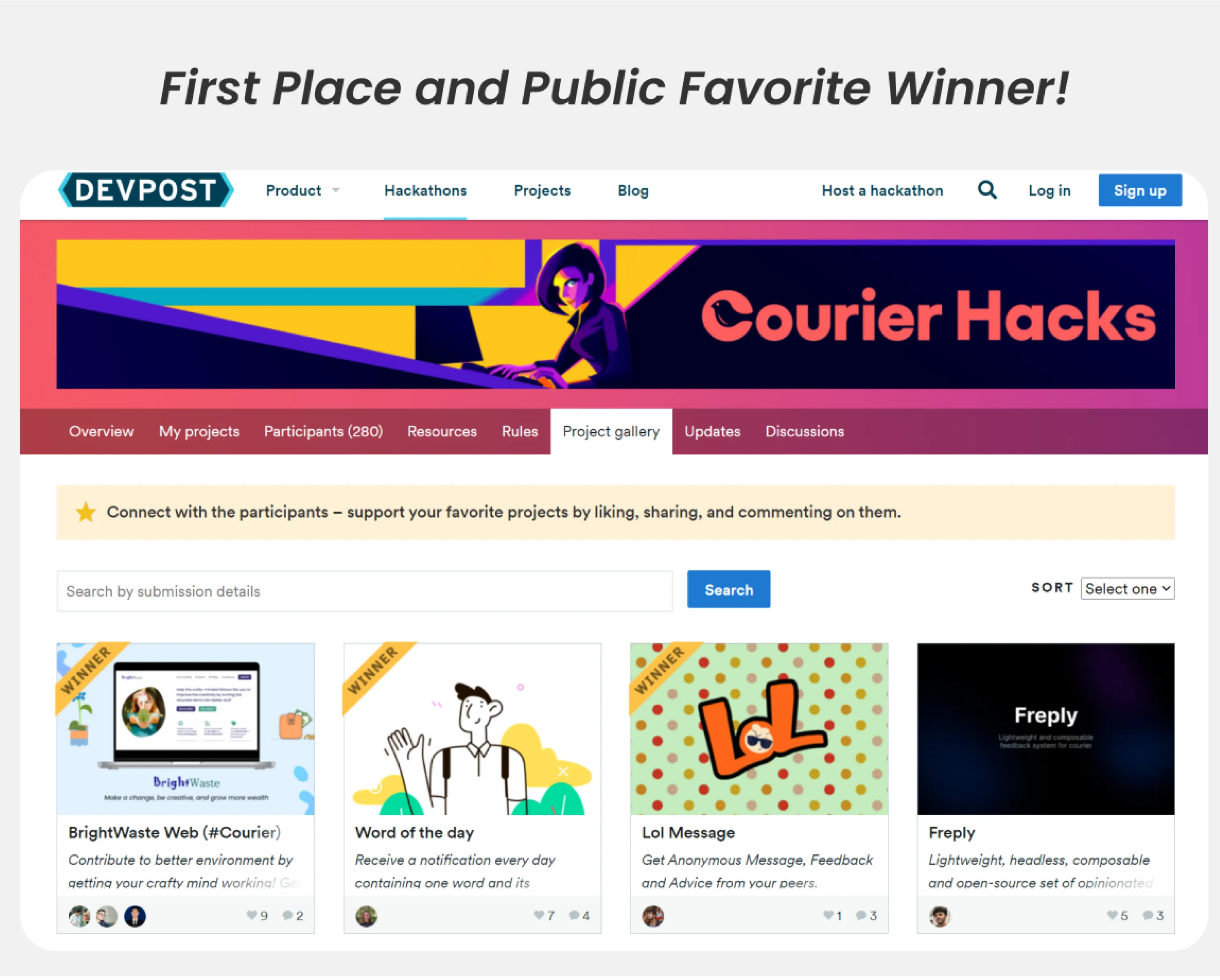
We are excited to share that we won first place and public favorite in the hackathon based on the design, ideas, and campaign video we made!
WHAT WE LEARNED
We learned...
Intervention is important
I believe that when a developer builds a product, there may be issues with spacing and alignment. In such cases, I would request to be added as a collaborator so I can directly add comments or fix the issues. This intervention only arises during hackathons due to time constraints.
Finding idea is hard but…
When an idea proves successful, I always aim to maximize its benefits for a wider audience.
It's impossible to solve all problems within short amount of time
While our idea is well-developed, we still need to address the crucial issue of shipping costs. Due to time constraints, we haven't been able to delve into this aspect in detail yet.
FUTURE SAYS...
What’s next?
- Contact potential partners or investors that want to work with us to develop this.
- Keep iterating the design concept and add important features, such as, shipping cost and store admin pages.
- We may continue the project early next year, after securing additional funding and recruiting more developers.
- Expand the platform to include features that help users discover local workshops providing innovative approaches to reducing household waste.
- Resolve the problem with shipping costs.