
TEAM
2 UX Designers, Project Manager, and myself as a Designer/Content Lead

DURATION
8 weeks
(Jan - Feb 2020)

TOOLS
Figma, Illustrator
INTRO
Increase shopping experience using a mobile app
In this recent era, people tend to use mobile apps for grocery delivery services, finding them more convenient. However, some people still prefer to shop in-person at grocery stores.
72%
of nearly 2700 adults
In the United States, preferred going to the grocery store during the COVID-19 pandemic.
83%
of them
Had issues with the delivery service and felt disappointed.
The primary reason people chose to shop in-store during the COVID-19 pandemic was due to issues with delivery services.
To address this, we proposed introducing a shopping cart that allows customers to scan items directly as they place them in the cart. Additionally, we planned to offer automatic discounts at checkout to help customers stay within their budget.
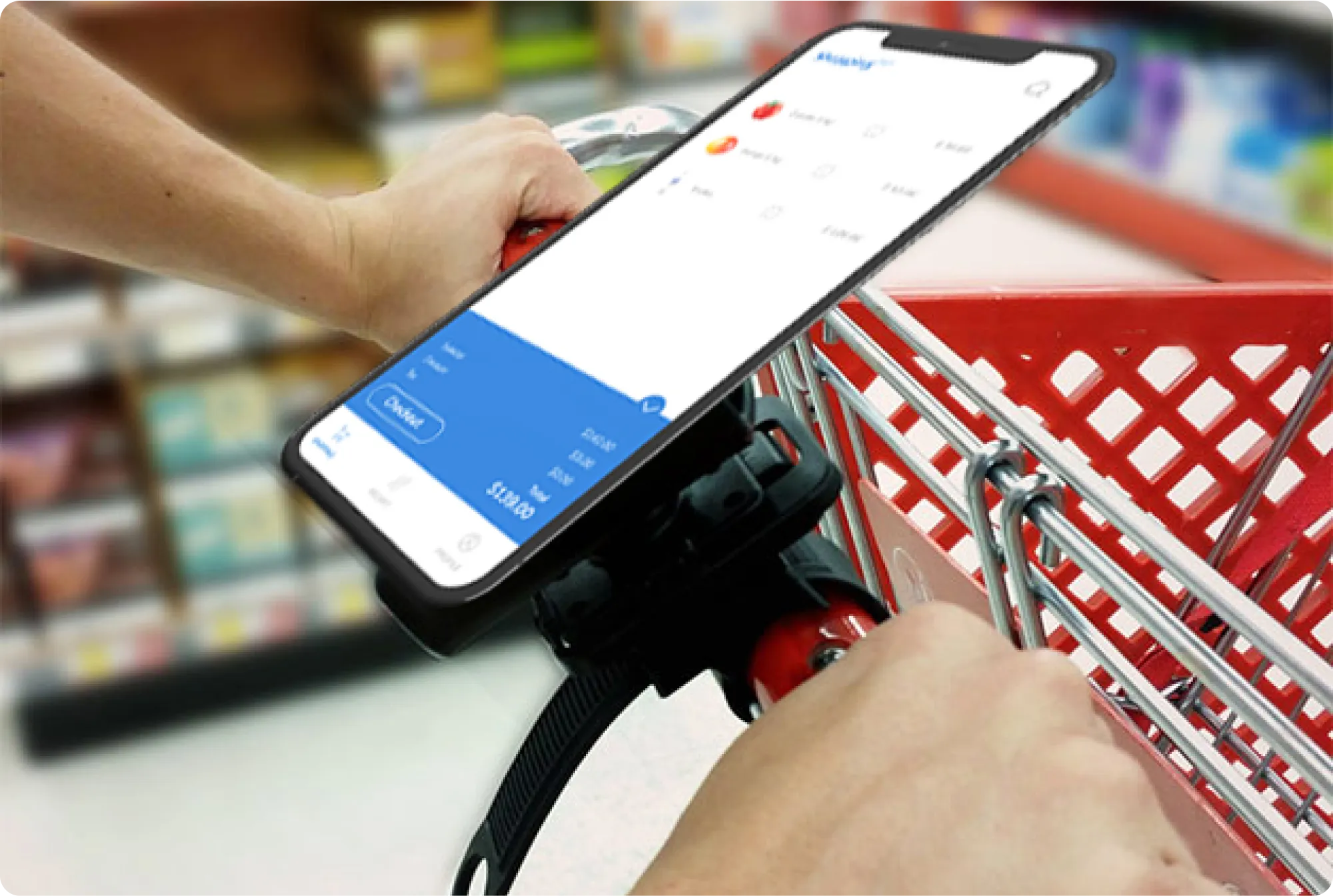
Above - This is what future shopping cart app looks like.
GOAL
Reduce the hassle of a long time in the cashier
We found that three out of the users preferred a quick shopping experience, taking less than 5 minutes for small items.
Shopping list
People listed the items they wanted to buy before going to the store.
A map location
A map for finding items in the grocery store (specific aisle) was not preferred.
The idea of getting recipes
All users preferred to get recipes based on the items that they bought.
Coupon or discount offers
Users appreciated the features that helped them find coupons or discount offers, saving money and helping them stay within their budget.
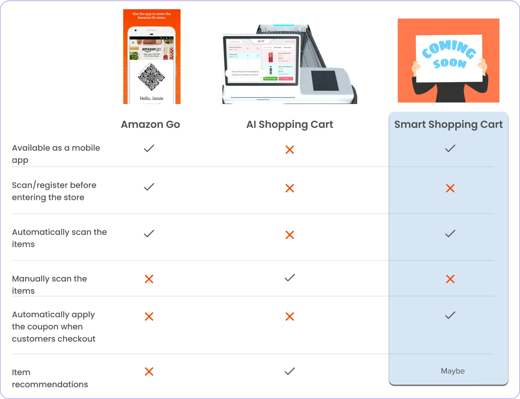
COMPETITIVE ANALYSIS
Evaluate the competitors' strategies
Our app will offer a tutorial, a user-friendly account setup process, and a reward program.
We've also included item recommendations based on our competitor analysis. To simplify the user experience, we've chosen not to include barcode scanning before entering the store.
SYNTHESIZING USER INSIGHTS
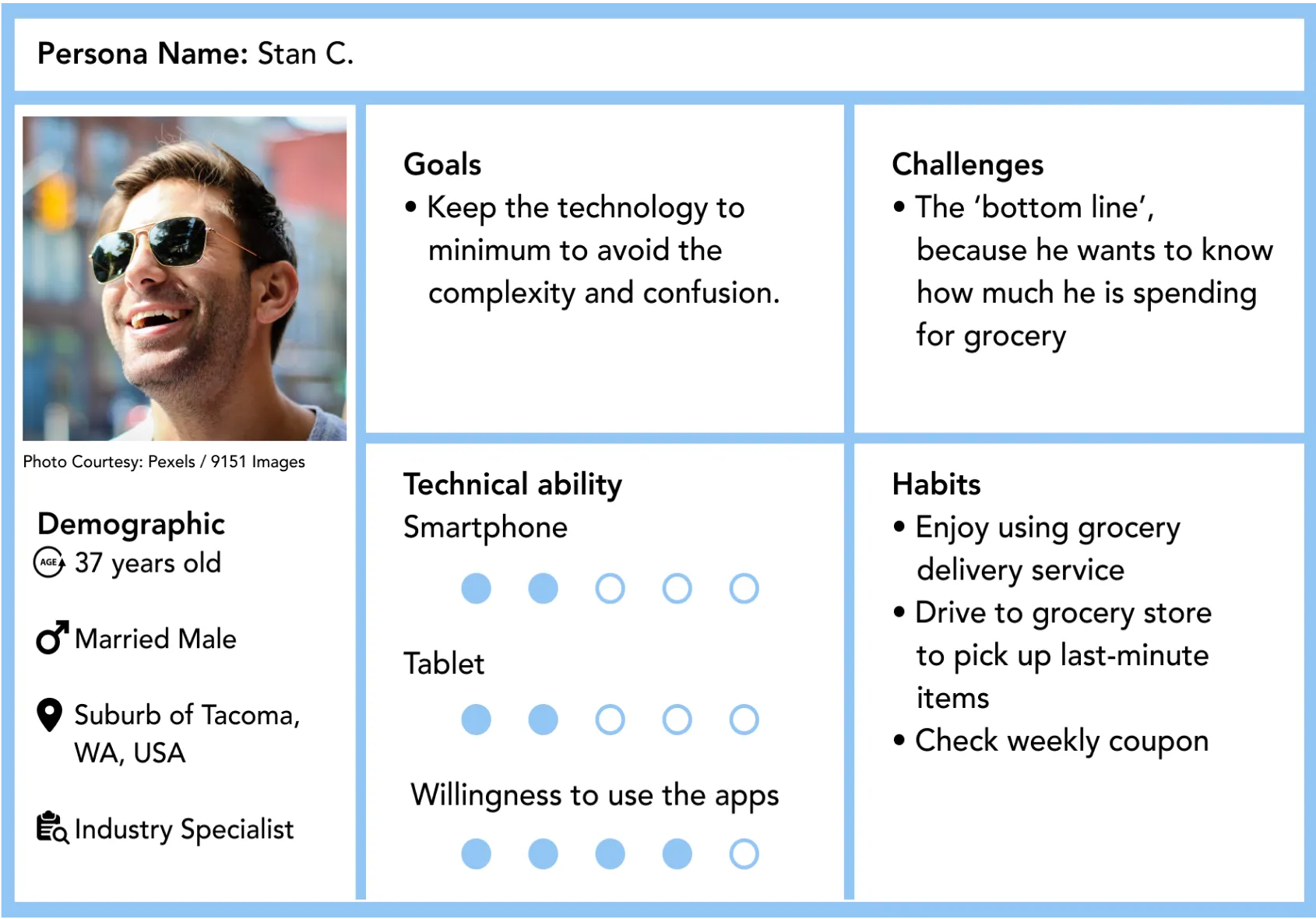
Track grocery spending with minimum technology
Our user called out that he was willing to use the app as long as it is easier to navigate and track how much he is spending for groceries.
Introduce a new technology with the easy setup
I advocated that the first screen is the logo that directs to sign up and tutorial. The illustration will be added to each tutorial. The language will be used as an opportunity to get the user excited to learn about the new technology.
Define the idea from the user journey
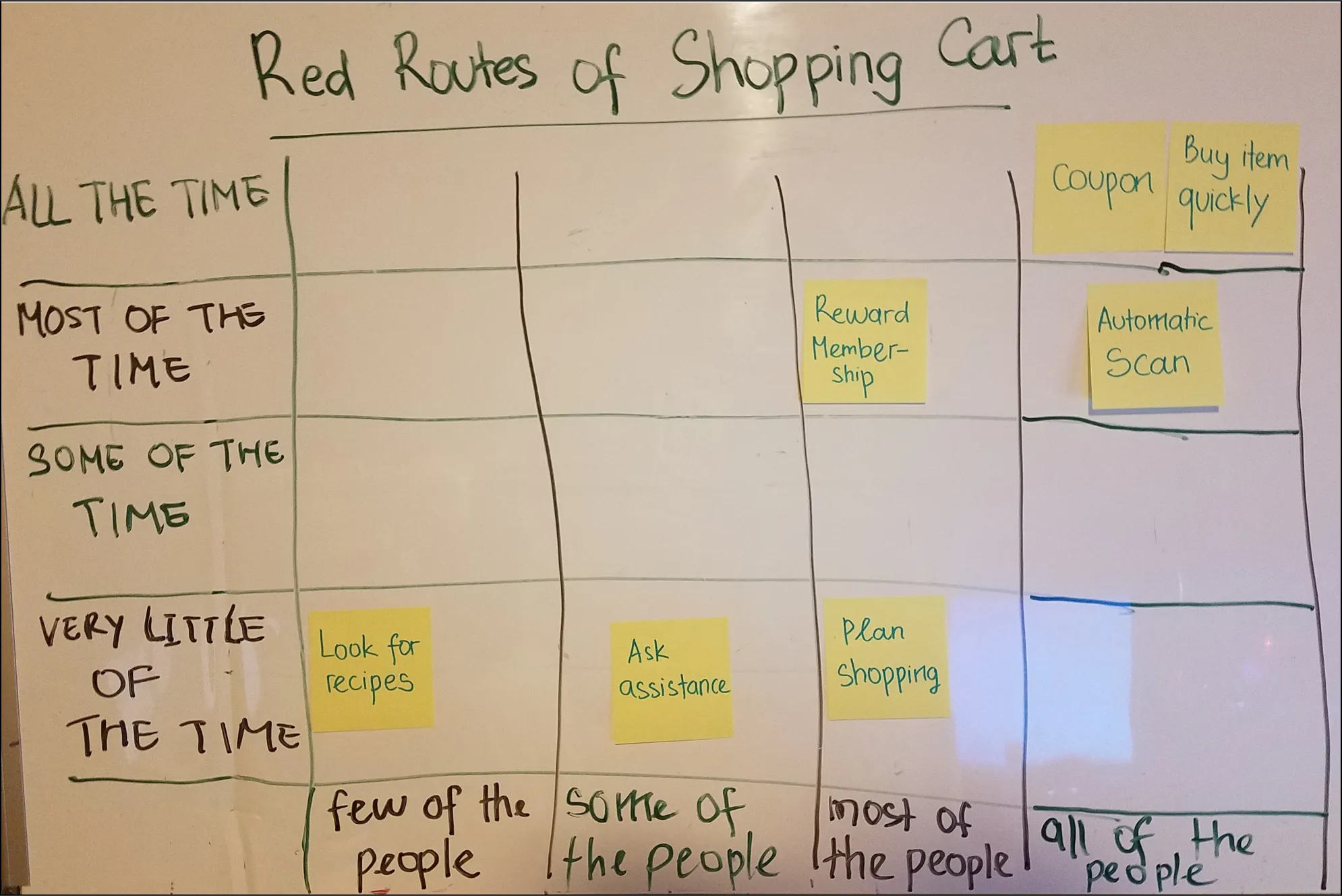
We used red routes to identify the user's most-frequently needs.
Based on the picture below, users preferred to use an automatic scan of grocery items because they wanted to shop quickly. Coupon and automatic scan also worked to help the users save money.
Checkout quickly with discounts automatically applied
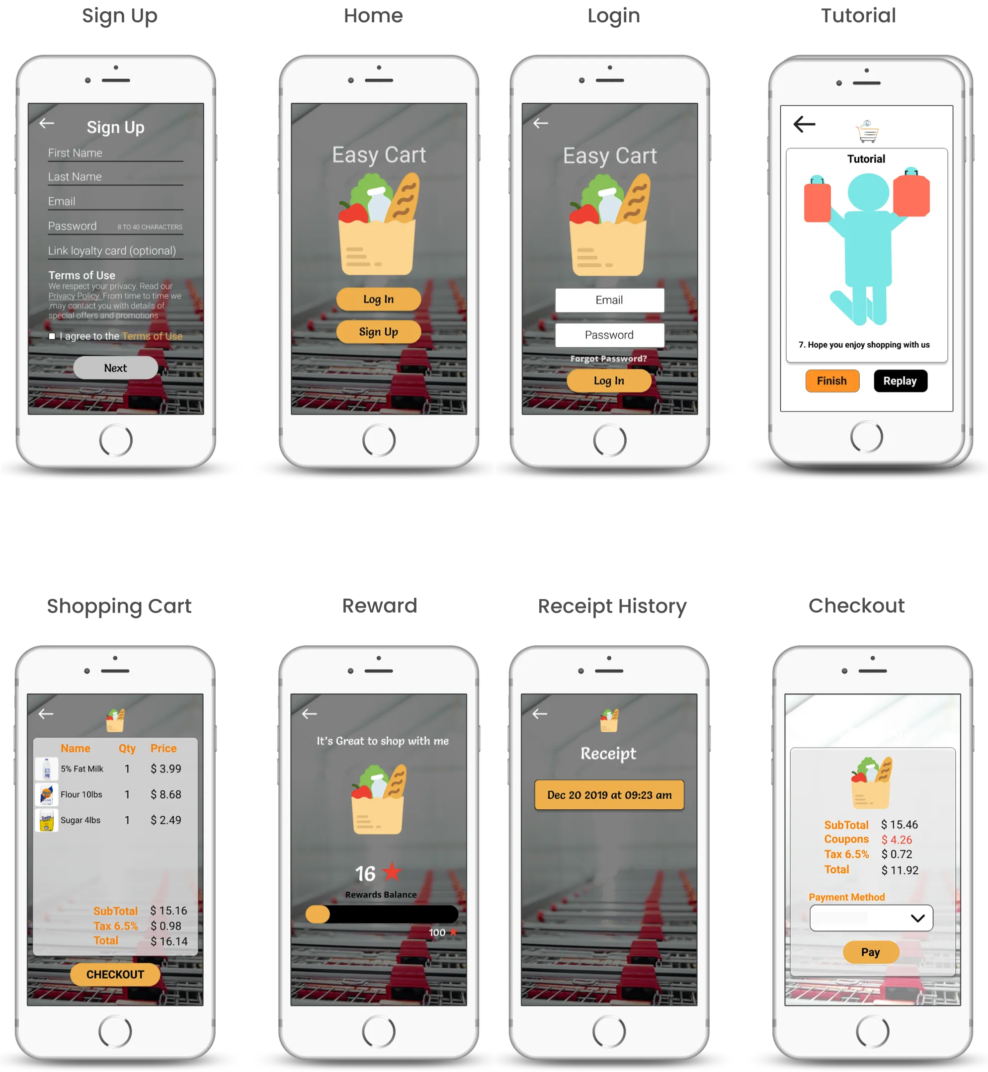
The features that we included in the prototype were:
- Account setup and tutorial on how to use the app
- Discounts applied when checking out.
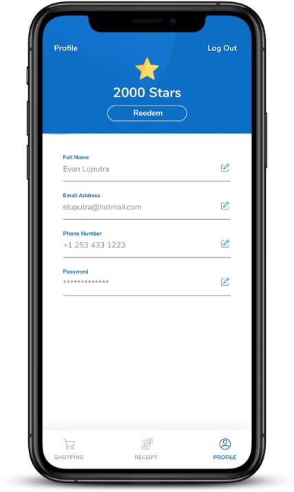
- Rewards after done shopping.
- Online receipt.
Below is still under version 1 of the design. We improved it in the next version.
Scenario and testing V1
Before we did the testing, we gave the user the scenario:
1. Users have to be able to sign up.
Users are able to follow and replay the tutorial.
They can understand how the reward works.
Users are able to check their purchase history.
Users can quickly and easily have their items scanned automatically.
While users successfully navigated account setup, rewards, and the tutorial, our analysis uncovered several areas for improvement:
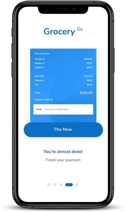
Steps of payment method options
Users found the process of adding a payment method too confusing due to the multiple steps involved.
They suggested a more intuitive approach, such as directly entering payment details instead of having to select from a dropdown menu.
Find the receipt
Users had a hard time finding the receipt. They took the time to figure out the 'History' button, which could direct them to the purchase history.
Issue with the UI
After talking to our design mentor, we realized that there was something that we lacked, which was the UI design. There was no color consistency between the logo and the button color. Also, we should pay more attention to the position of the text and the font size.
Focus on the design looks
We enhanced our design with new UI elements, leading to these findings.
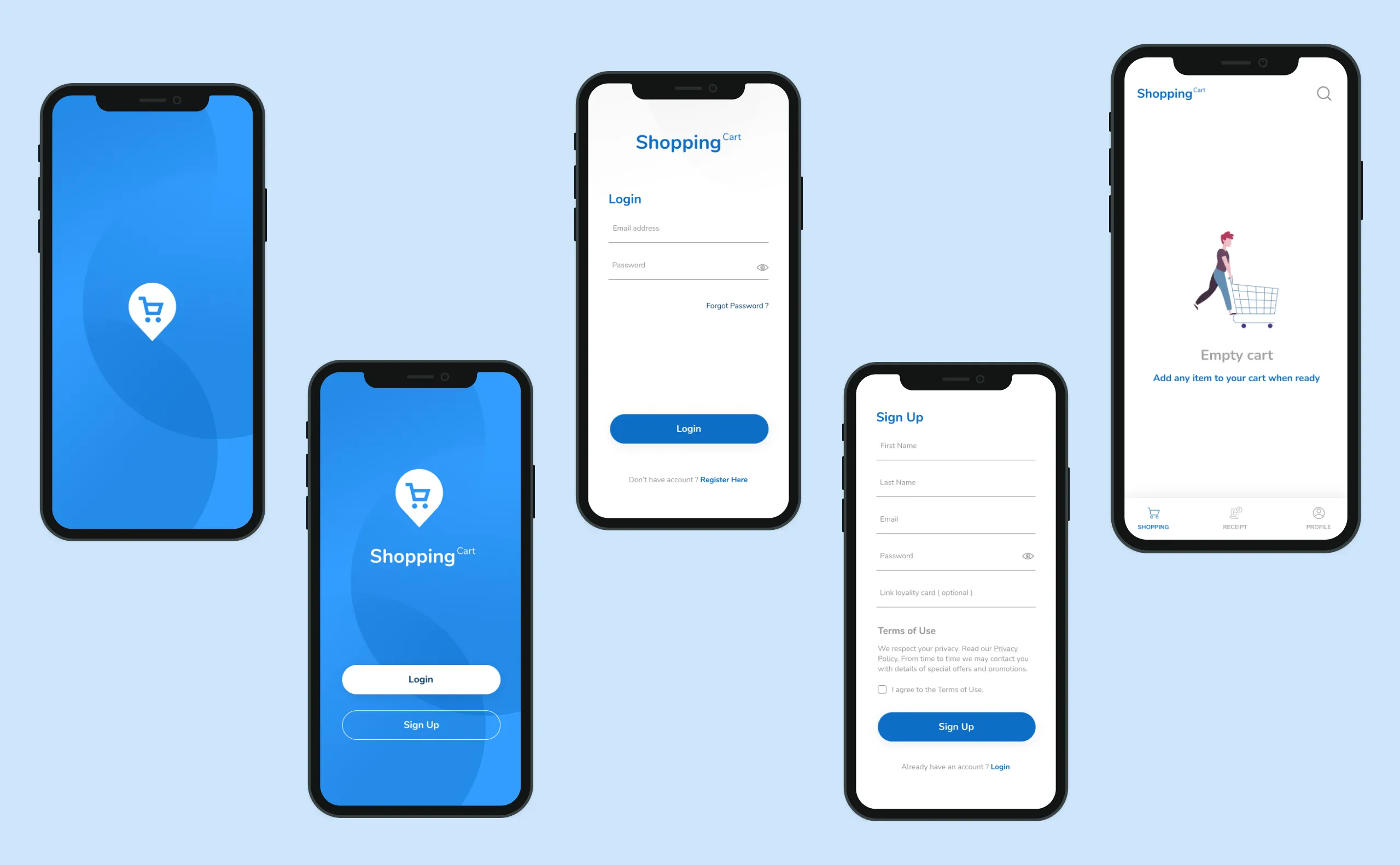
Set up an account and view simple tutorial
- I created a seamless design with a blue background.
- We attempted to adjust the picture's size to balance with the font beneath it.
Grab the items and check out
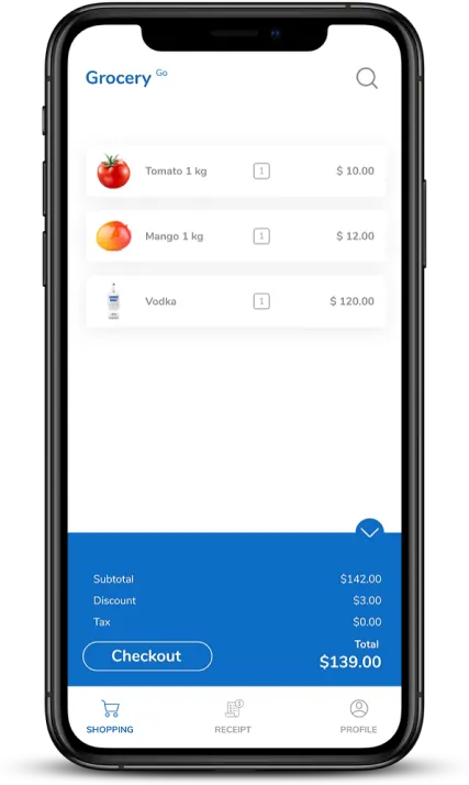
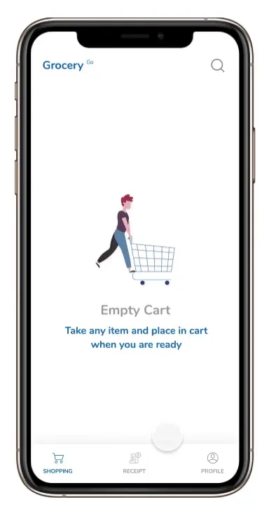
In the checkout page, discount was automatically applied to the system. And after pressing the checkout button, users will be directed to payment method options.
The cart will be automatically updated when we put the stuff in the cart. Discount was automatically applied to the system.
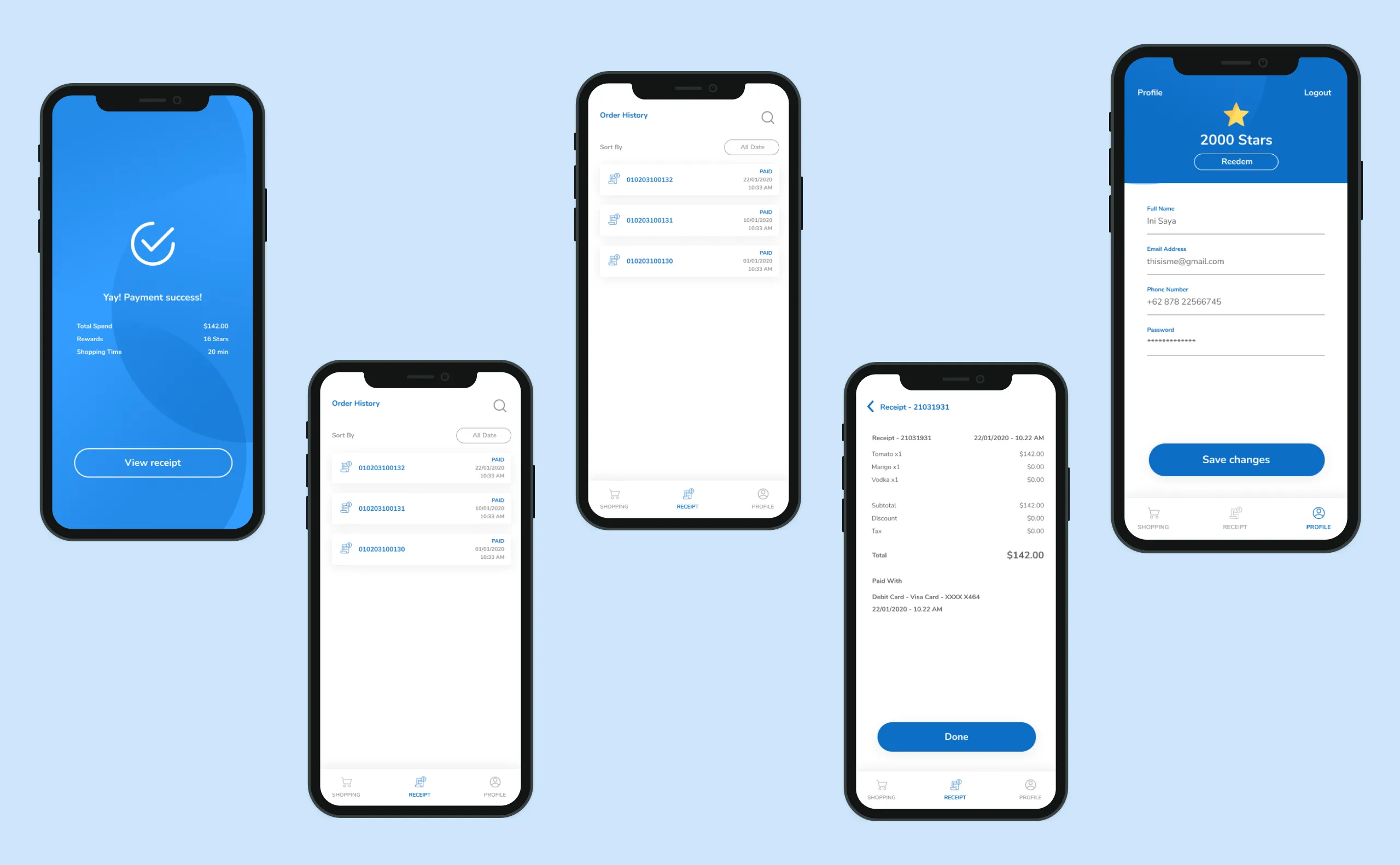
Get a receipt and collect the reward
Receipt and reward are available right away after users pay the items.
The results fulfilled our expectations
We conducted the test and found all users could use the app without any help from us.
"I like the discount that directly applies when I check out."
"The tutorial is easier to follow!"
5/5
Users were able to check the reward.
4/5
Users admitted that receipt history helped them to track how much they spend monthly.