Parabled
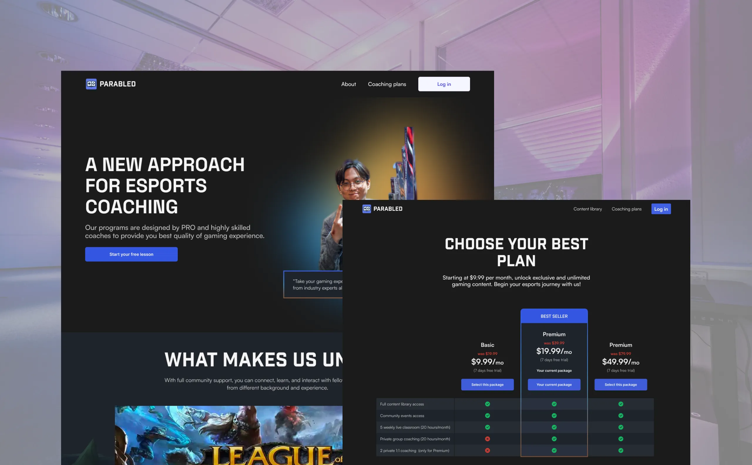
Revamping an esports coaching platform website that enables esports enthusiasts to level up their gaming skills at an affordable price.

TEAM
5 UX Designers, 5+ Developers, 3+ Product Managers, and myself as a UX Writer

DURATION
Sep 2023 - Feb 2024

TOOLS
Figma, Google Docs, Trello
OVERVIEW
Esports is growing, and so is the learning platform
Parabled has a vision of becoming the next biggest esports coaching platform, not only offering one game (the current game being League of Legends) but also branching out to more games, such as Valorant, Mobile Legends, and others.
Analyze the issues of existing Parabled website
Analyzing and reviewing the previous Parabled website was the best approach before conducting user research and revamping the entire website directly.
These were our analysis of the website:
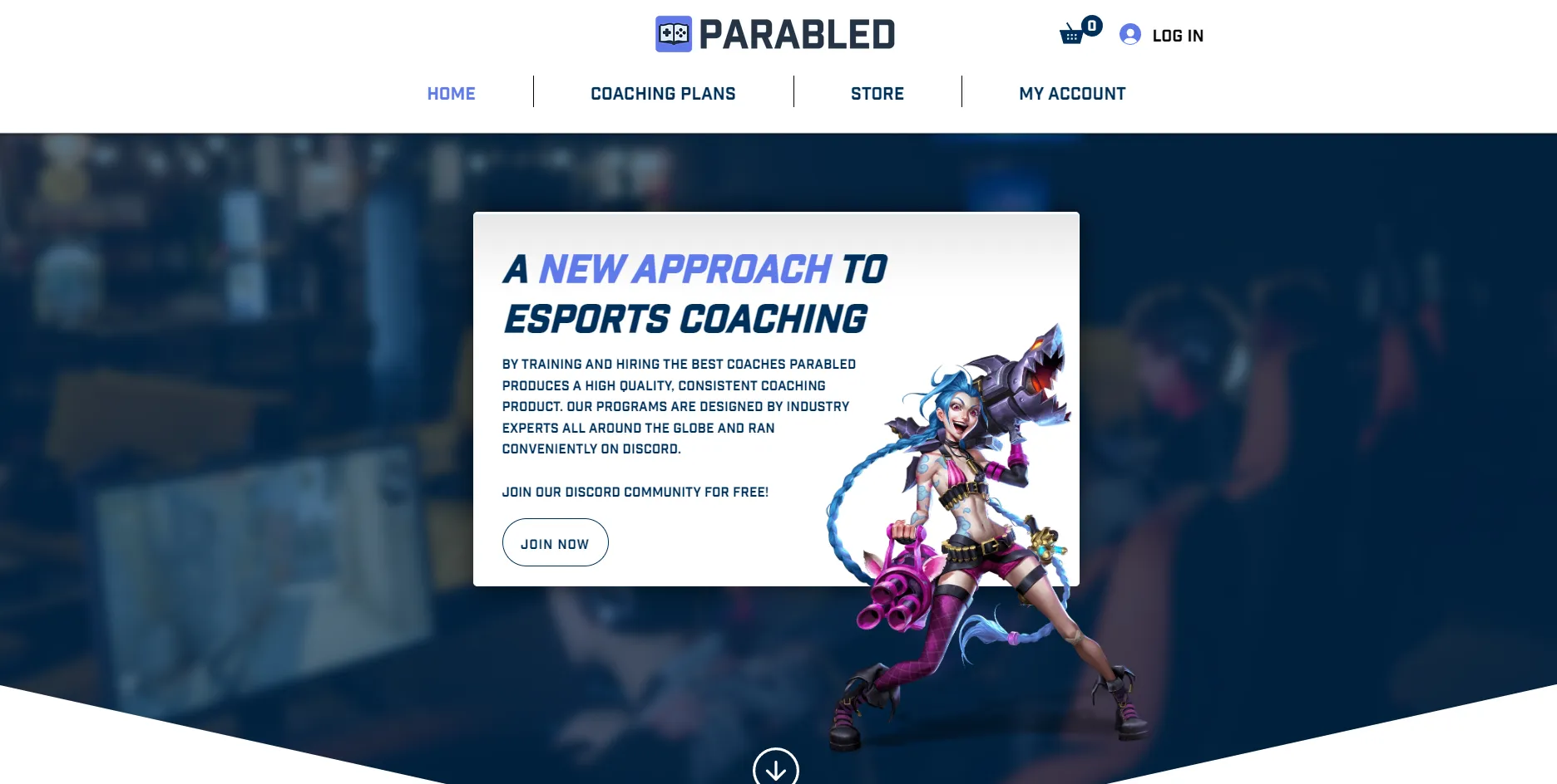
➡️ The font was in all caps
The font gave the impression of 'shouting' rather than inviting people to join the platform.
➡️ The alignment was a bit off
The alignment of the website seemed off due to the limitations of the website builder. Customization options for alignment were limited.
For instance, the "Log In" button was not aligned with the navigation bar.
➡️ No clear CTA
There were no call-to-action elements on the website, aside from directing users to Discord. But what's the point of joining Discord if our primary goal was to sell the service?
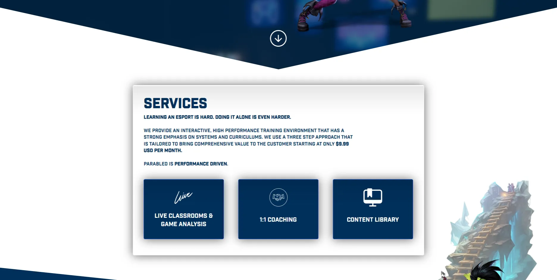
➡️ The website contained too much text
➡️ The cards looked like clickable
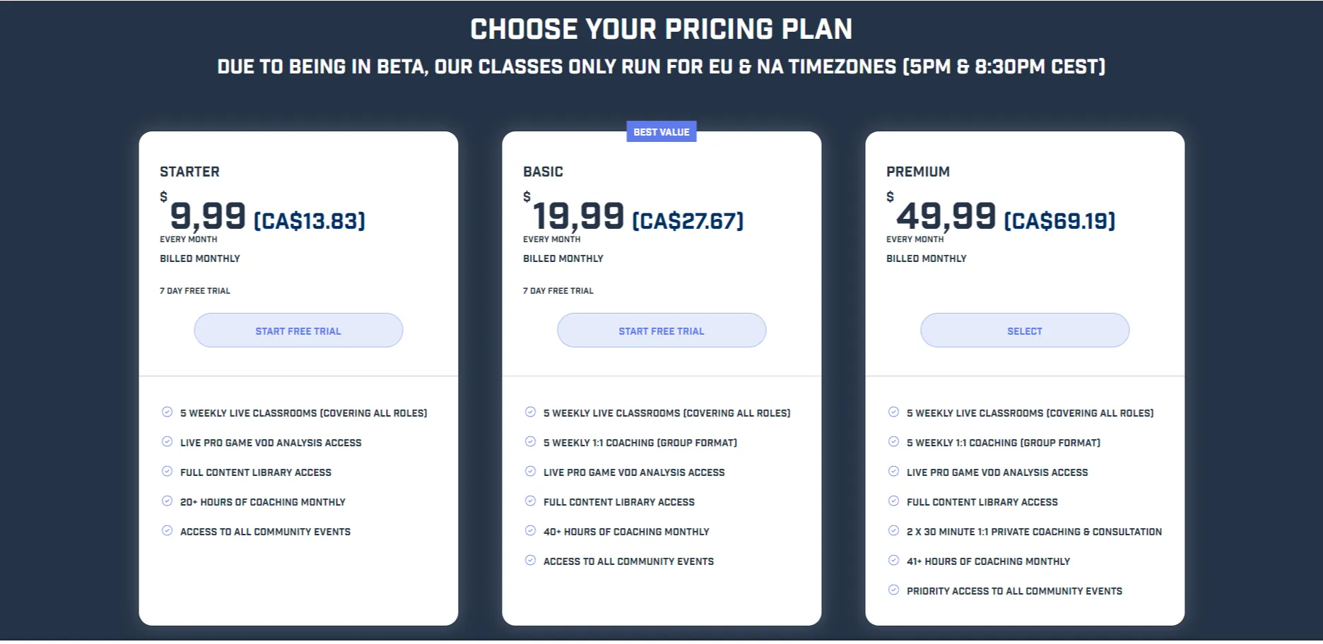
➡️ Each package was not complete
The subscription plan page was confusing. Each package began with the statement, "5 weekly live classrooms." The question was:
➡️ It didn't show the difference
The package didn't clearly show the differences between the three options. We needed to spend a few minutes reading to understand the distinctions.
➡️ The 'best value' text was too small
I understand this can be viewed from both a marketing and UX design perspective. However, to sell the item, we need to make the UI and content more visually appealing and engaging to attract users to click.
Perhaps we could try making the button ('Best value') bigger or changing the card color to differentiate it from the other packages?
TWO RESEARCH METHODS
Gather insights from different approaches
To get a better understanding of the esports industry and expectations of the current and potential students, we utilized two research methods: competitive analysis and customer interviews.
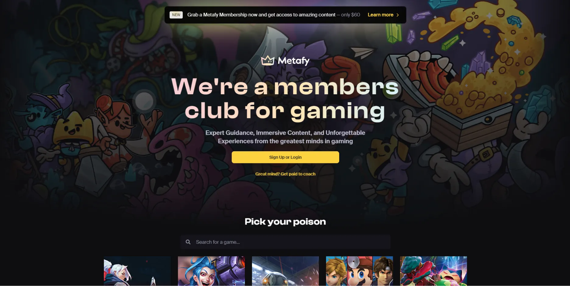
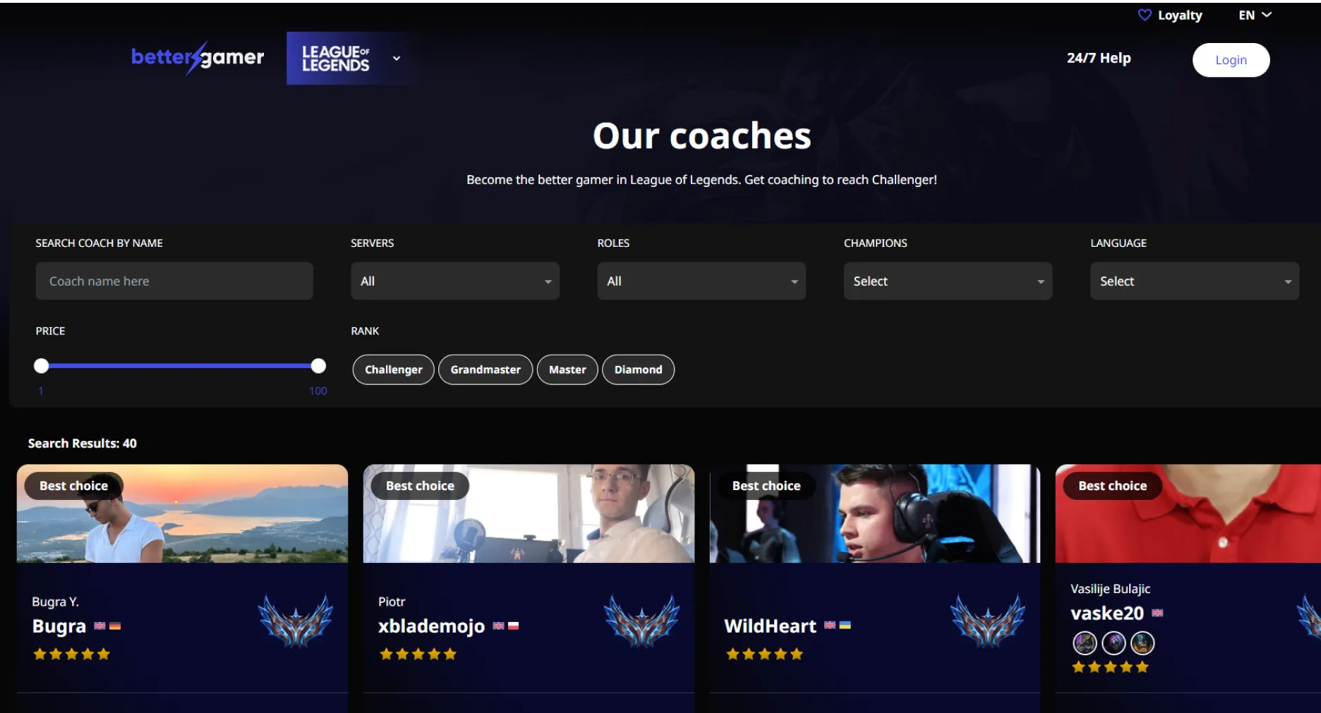
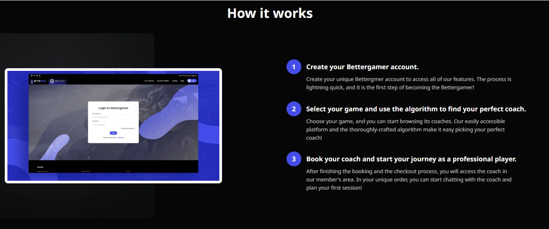
➡️ Competitive analysis
At the time we conducted the research, there weren't many coaching websites to compare with, aside from two competitors.
➡️ User interviews
Since Parabled operates in both the U.S. and Europe, we focused on recruiting:
- 10 participants from the U.S. and European countries.
- Age: between 17 - 30 years old.
- Preferably 5 students who had previously used our platform and 5 new users who enjoy playing online game.
Here are some insights we observed:
- 5 out of 5 potential users were not willing to pay for the plan if there was no clear benefit to what they would receive.
- 3 out of 5 existing students would consider continuing the subscription because they liked the coaching and the coaches.
- 2 out of 5 potential users wondered if other esports would be offered in the future.
DEFINE USER'S NEEDS
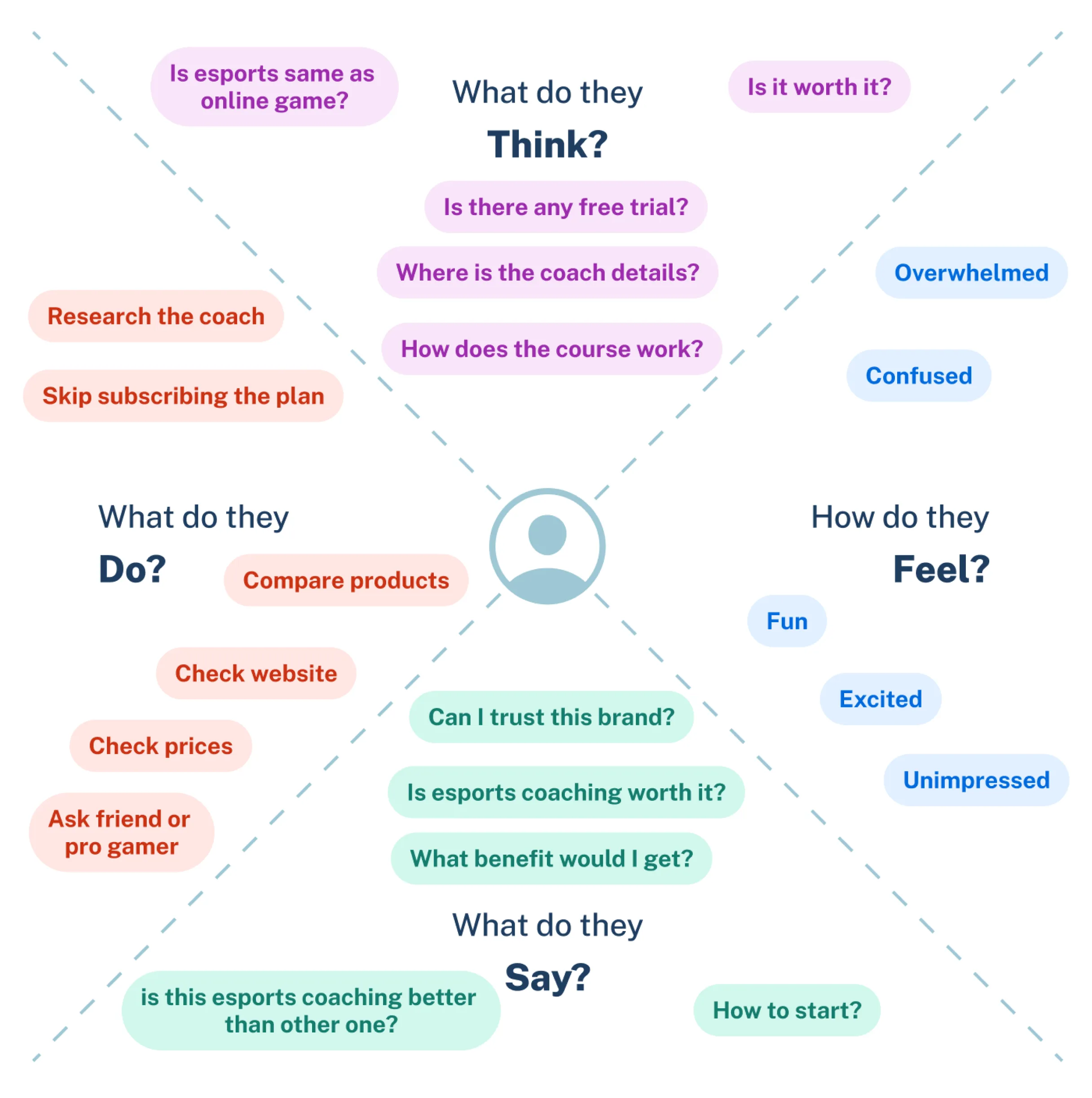
Synthesize the empathy map
During the interview process, we noticed similar patterns among both potential and existing students.
"I would like more details on what each subscription plan offers."
"I don't like when information is cluttered with too much text."
"Are all classes hosted on Discord or on the website?"
HOMEPAGE IDEATION PROCESS
The landing page should list all the benefits
The research results focused primarily on the benefits students would like to gain after subscribing to the monthly package.
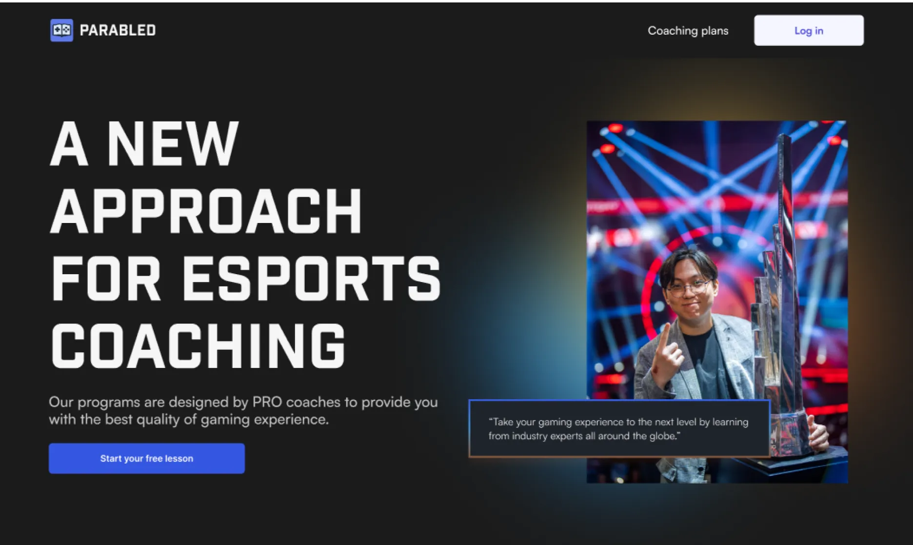
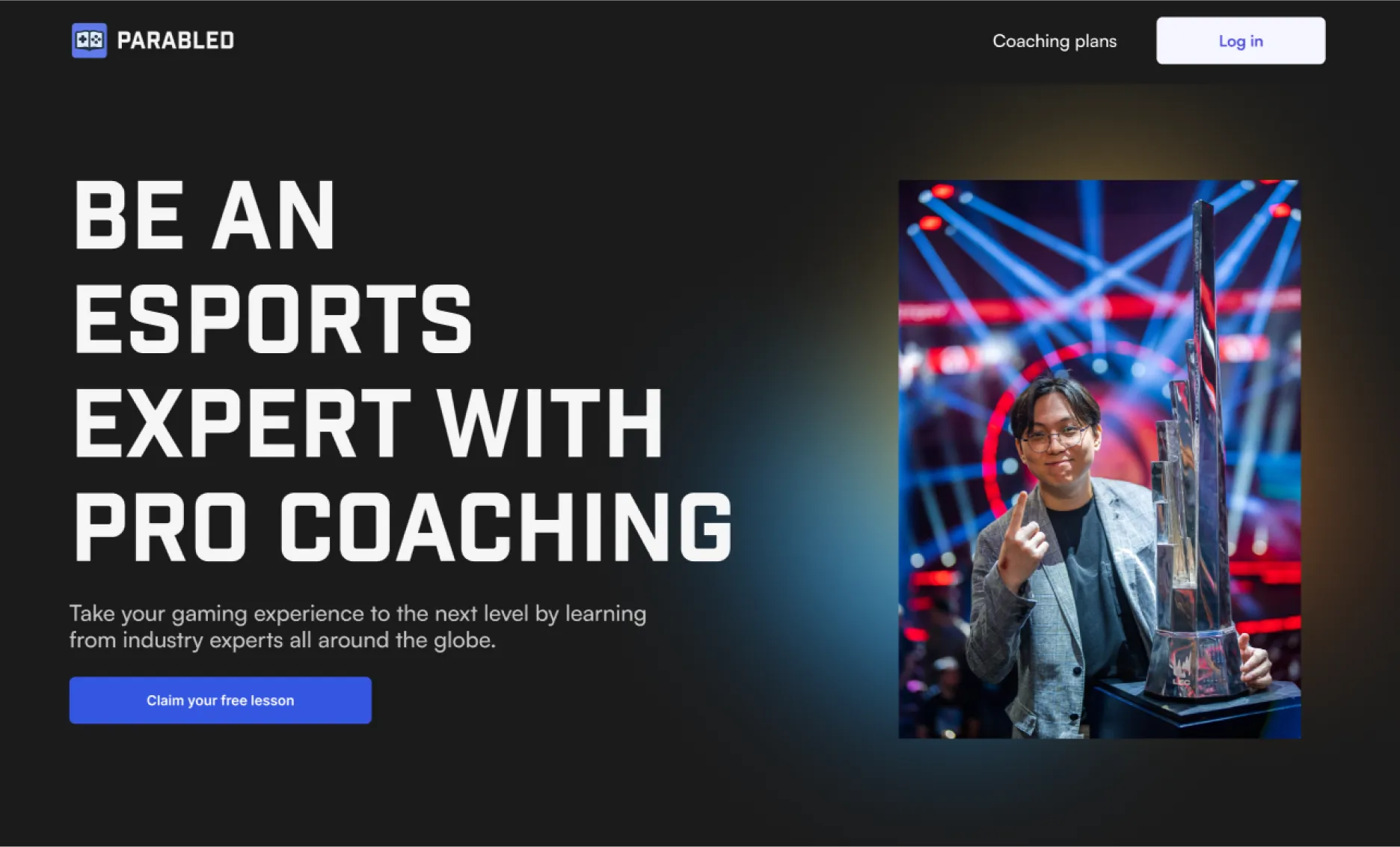
Based on this, I drafted two options for the landing page, both of which direct users to start a free lesson.
First option
Second option
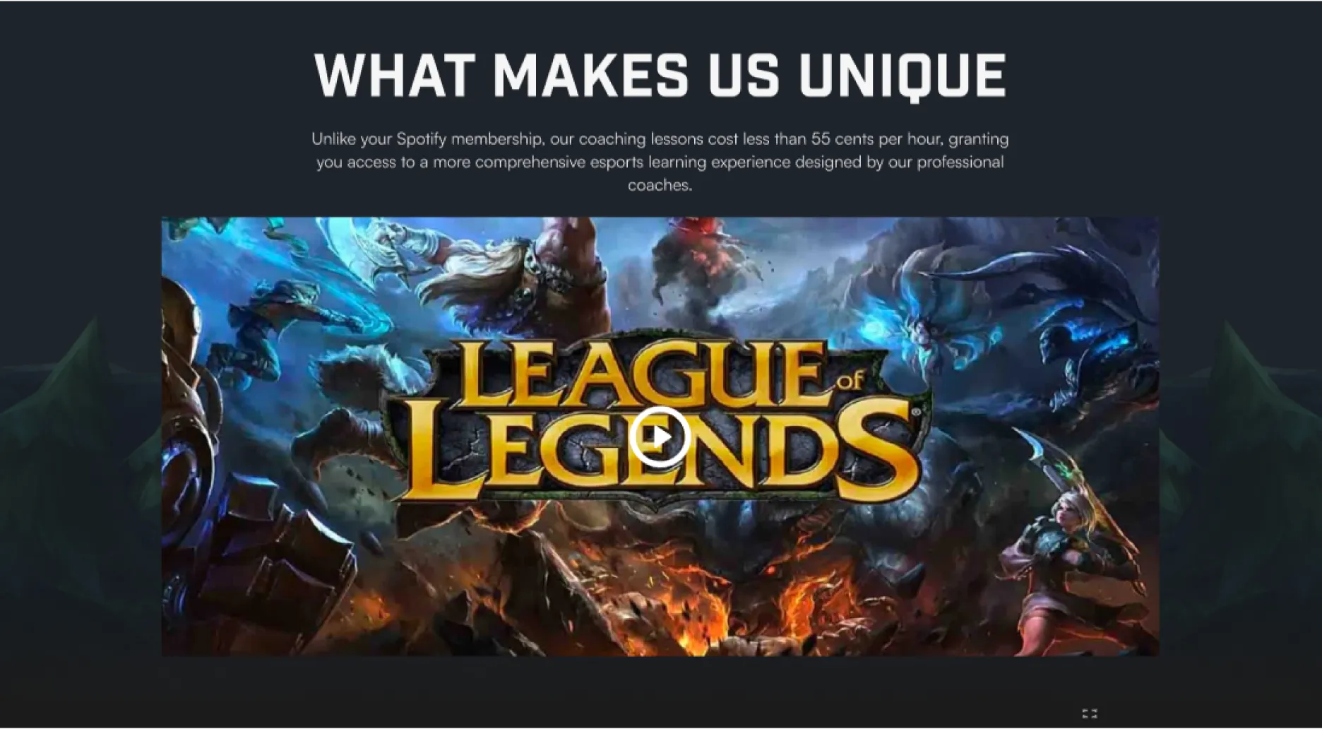
We compared our plans with others = marketing strategy?
I'm sure many gamers listen to music through YouTube Music or Spotify, which is why the co-founder asked me to compare the plan with Spotify's. This inspired me to incorporate it into the content as part of our engagement strategy.
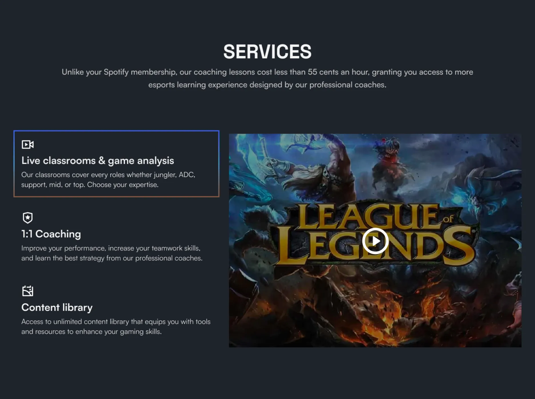
What services in Parabled should look like…
We often watch long streaming videos without fully understanding the players' actions and movement types. With Parabled, you can rest assured—we provided detailed explanations of what pro players should do in every game scenario.
Let's add an additional button!
The call to action is an additional feature located at the bottom of the homepage, near the footer. I took the title from the previous website and considered expanding on it for the second design.
Previous design
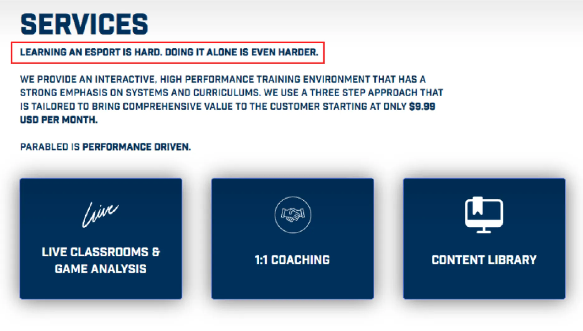
Current design
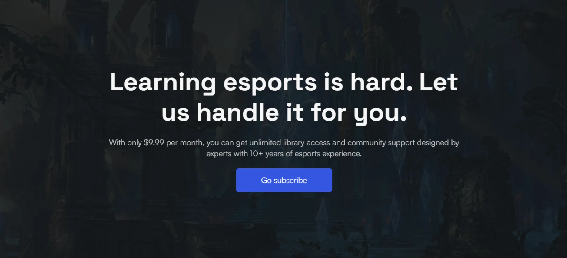
IDEATION - SUBSCRIPTION PLAN
The subscription process should be simple and seamless
With an enhanced design and clearer explanations, the subscription process can offer a seamless experience.
I added the monthly hours to the live classroom and coaching section to help students understand how much time they should dedicate to becoming a pro gamer.
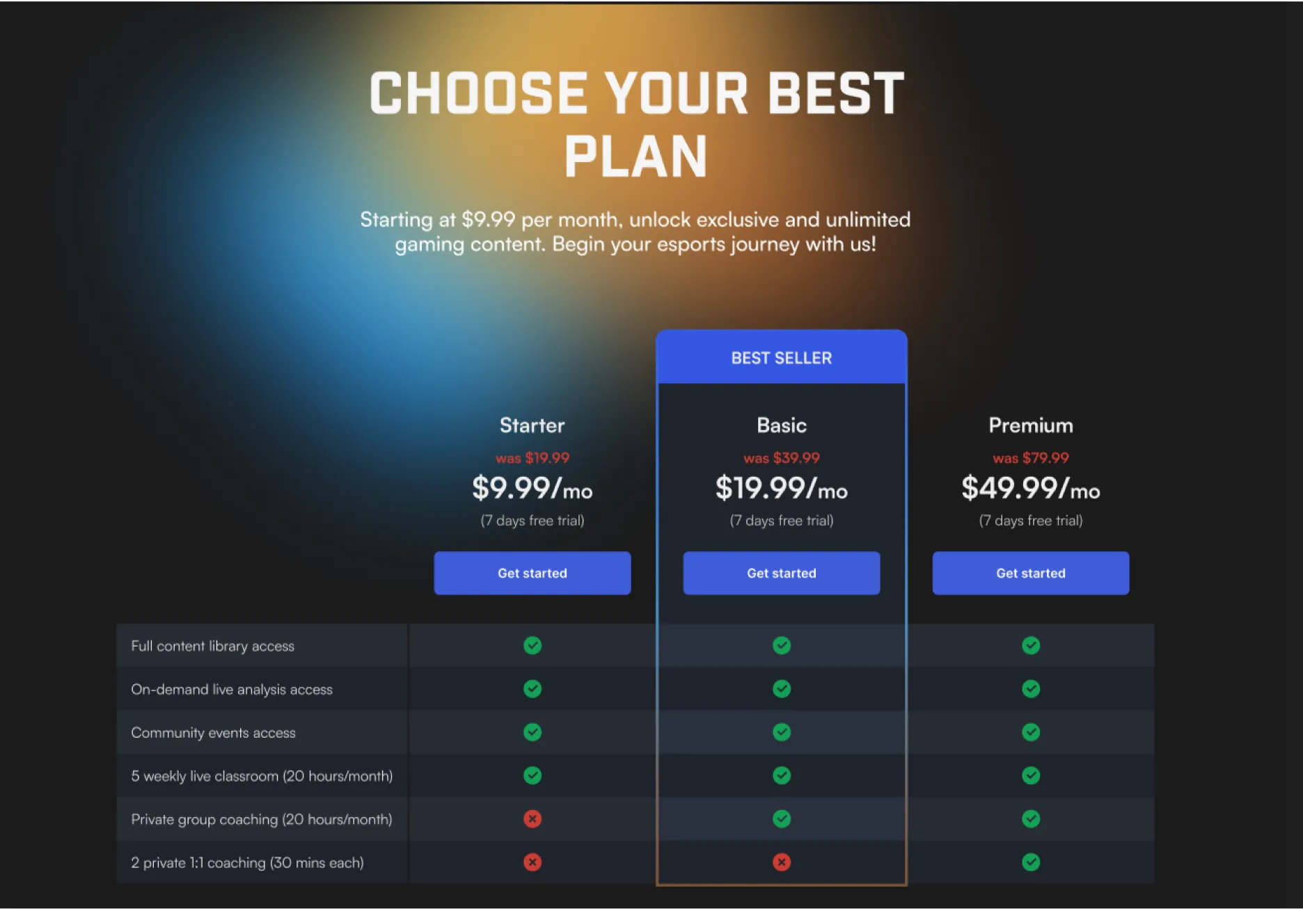
CURRENT PROTOTYPE
Current live website
Due to Webflow's limitations, we couldn't implement the design created above on the landing page. However, the design worked well on the other sections.
Despite these limitations, we continued to iterate on the design and content, with our designers creatively adding moving backgrounds to give the website a more dynamic and 'alive' feel.
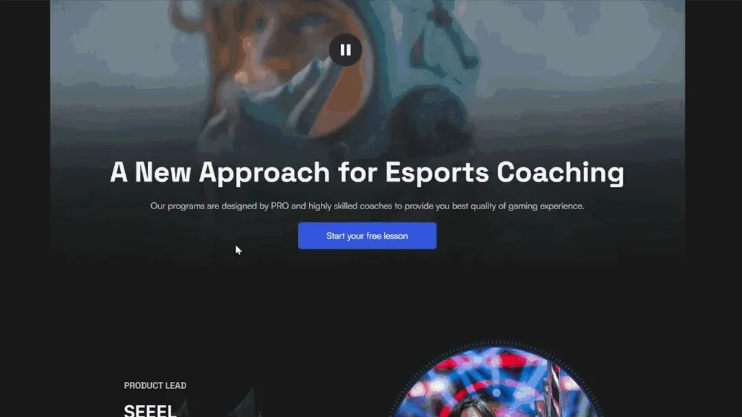
USABILITY TESTING USING MAZE
Results were unexpected!
After the revamp, we were ready to test it with users.
We used Maze to conduct usability testing for our homepage. These were the key points that 12 users (5 esports players and 7 non-esports players) found most interesting:
- People liked the idea of a free lesson.
- The clean layout and staff quotes intrigued them and made them want to learn more.
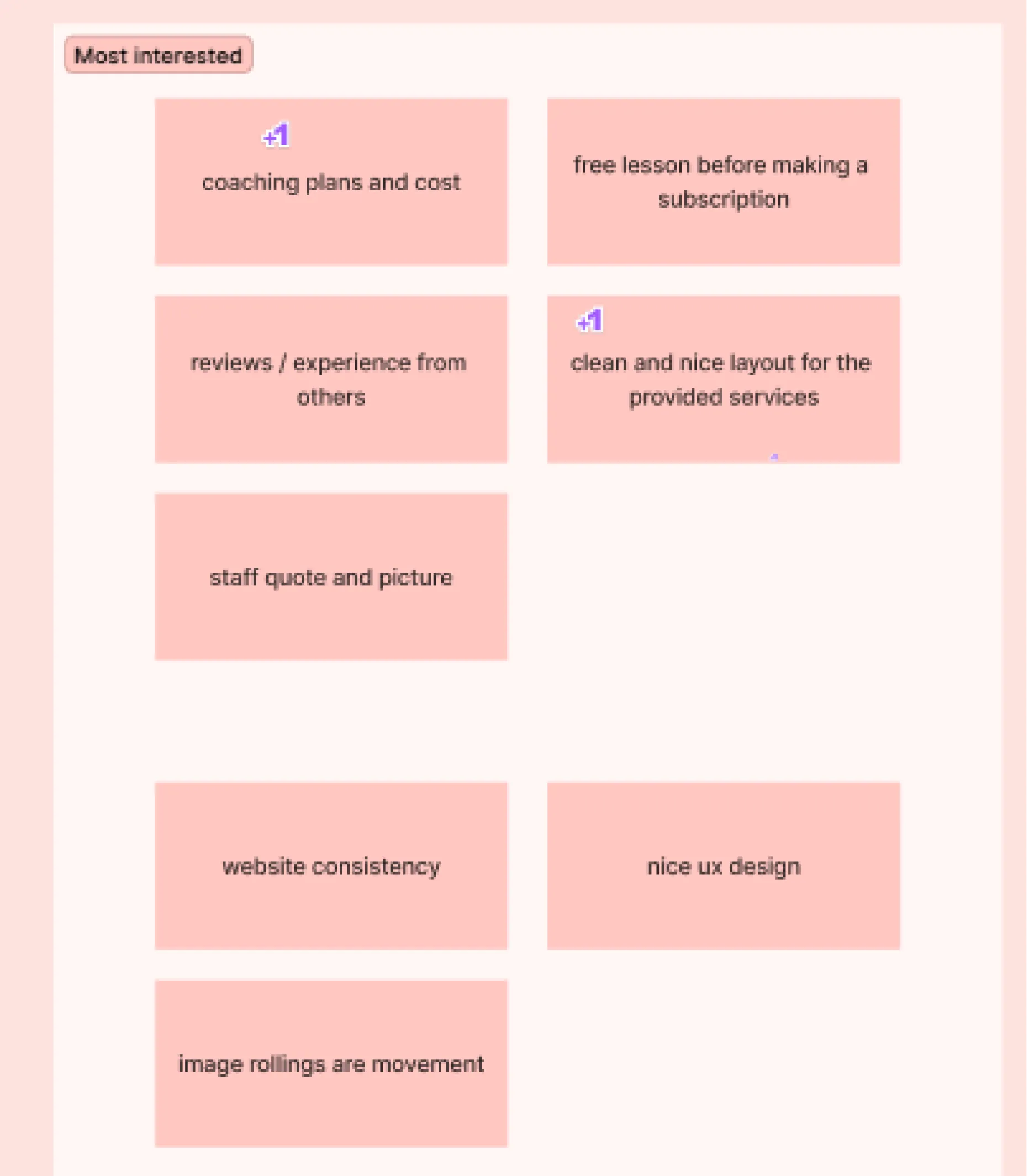
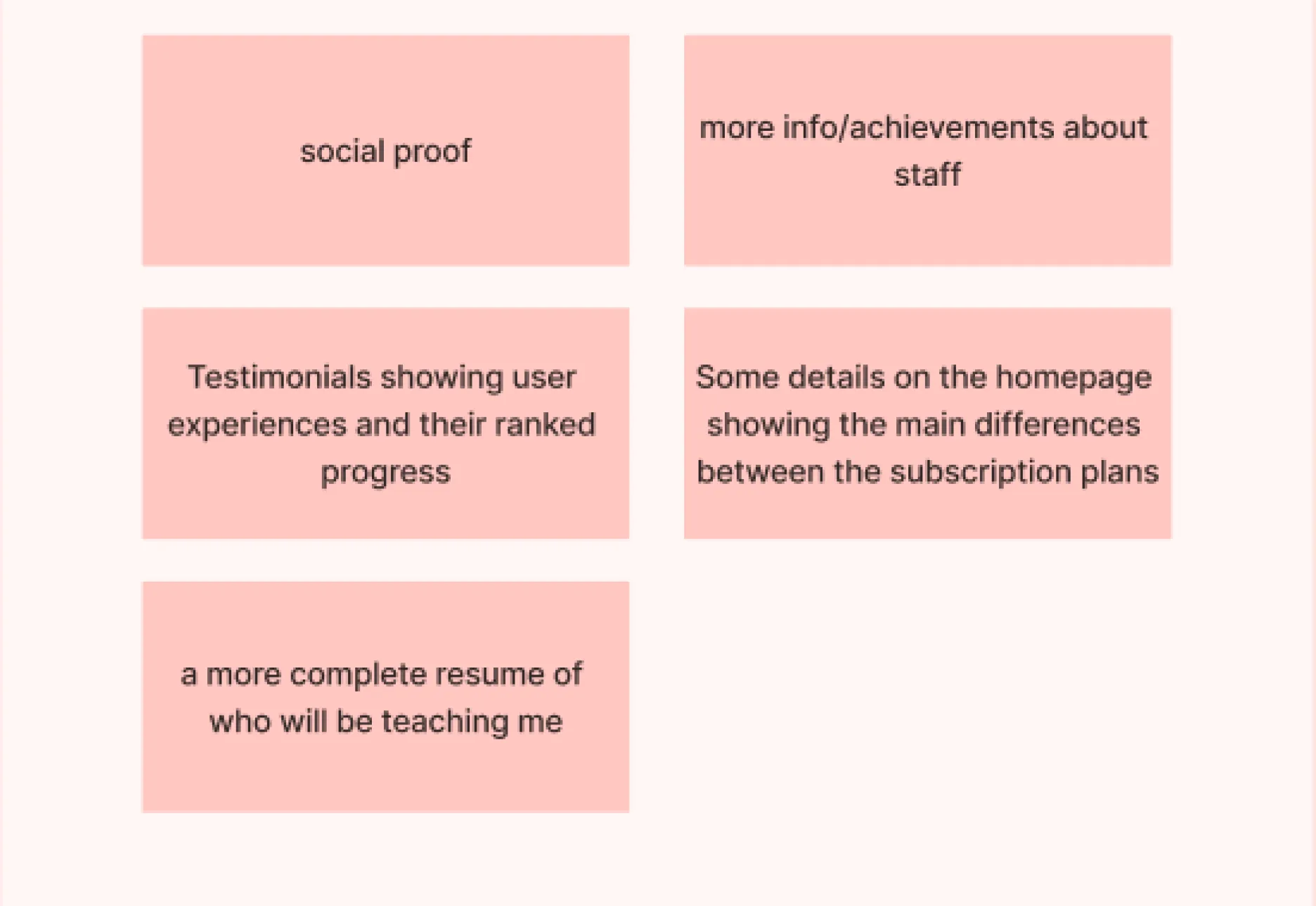
Users expected to see more details before deciding to subscribe
As we are still new, we don't have much in the way of social proof or staff achievements. However, we will consider this for the next iteration.
The positive takeaway was that users clearly understood all the details we provided on the website, including the services, subscription plans, and testimonials.
Mission accomplished! 🎉🎉
I felt relieved upon seeing the results from the subscription page. Users understood that each plan offers different services and their expectations regarding the number of learning hours were met.
These were the results of what triggered users to subscribe to our plan:

WHAT I LEARNED
Challenges made me better!
I faced a few challenges when trying to create better-written content for the esports website.
➡️ My background isn't from esports
Although I play some games, I still need to learn what esports looks like and put myself in the shoes of pro gamers.
➡️ Collaborate more with founders team
I worked mainly with founders who were a bit picky about the wording or statements related to esports, but I managed it. That's why I always provided multiple options for each page.
➡️ Usability testing doesn't end after development
We need to keep iterating on design and content. I always find ways to listen to feedback from users and the team.
➡️ UX writing is not about writing only
Initially, I thought UX writing was just about text, but it's much more than that. We need to adjust the content based on accessibility principles and collaborative design. UX writers work closely with designers to ensure that text and design elements complement each other.
WHAT’S NEXT
Revamping company’s branding
The CEO and Co-Founder decided to change the company name to Savicore due to a copyright issue. As part of this, they also rebranded the entire font style and color scheme. I am also involved in this project, and I will include updates in my future case study.